Magnolia Yoga by Gabrielle
New Brand Visual Identity and Website
MY ROLE
Brand Strategist
Web Designer
SCOPE
Coaching
Design and development
TOOLS
Figma
Wix Studio
Magnolia Yoga by Gabrielle is a small business focused on building inner and outer strength through movement and events.
The owner, Gabrielle, was seeking to start her business by offering online classes in the scope of a membership model. This was her first offer, striking out on her own, and she needed help creating a brand and website that evoked the essence of her energy and her classes.
Project Overview
Context
Magnolia Yoga by Gabrielle is a first-time business owner who is looking to launch her services online. Gabby’s new focus is to build and grow her business as she continues teaching classes in-person at different yoga studios.
Problem
Busy women interested in the physical and mental benefits of yoga and pilates are lacking community. Magnolia Yoga by Gabrielle does not have a brand presence nor accessible services online to help provide the solution to this audience. We need to create a brand that the target audience connects with, and provide a way for them to easily practice their movement in a fun and community-driven environment.
Goal
Magnolia Yoga by Gabrielle’s overall goal was to have a launch pad to begin promoting her brand (awareness) and creating first-time clients through her online classes (conversions).
Design Impact
🎨 Created branding visual identity assets for a first-time business launch
💸 Designed and built a website to promote first-time offers with conversion metrics in mind
🚀 Coached the business owner in design + strategy, facilitating direction of her offers and online presence
Case Study
BRANDING
“What do you offer and how is it different from others?”
Introducing the phase approach and project needs
Being that this was an emerging business, I struck out to help Gabby get very clear about her offers, mission and vision.
Before embarking on the visual identity, we had to align on who she was as a teacher, what she offered, how it was unique — essentially, the essence of her and the service she wants to provide.
I broke this project down into two phases to help structure the deliverables:
1. Brand Identity
Understand Gabby’s unique selling proposition (USP)
Understand what makes Gabby’s classes stand out and special, amongst the various other teachers
Create a well-rounded identity that captures Gabby’s essence, hence Magnolia Yoga by Gabrielle
2. Website Design & Development
Define success metrics
Create a streamlined and conversion-friendly flow
Brand Identity
Stylescapes
After meeting with Gabby and reviewing the questionnaire I’d sent her, I created three stylescapes that encapsulated the potential visual identity directions we could go in.
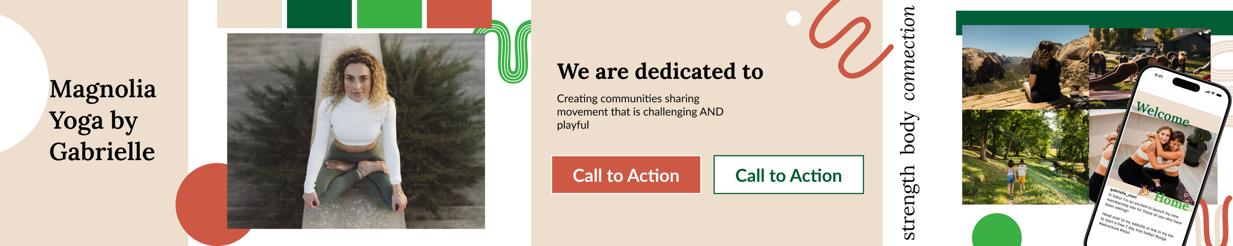
Stylescape 1: FUN MATURITY
Incorporates a playful take with maturity, offering a grounded, down-to-earth feel.
Stylescape 2: BOLD PLAYFULNESS
Offers a playful take with boldness, creating an energetic and feminine blend and vibe.

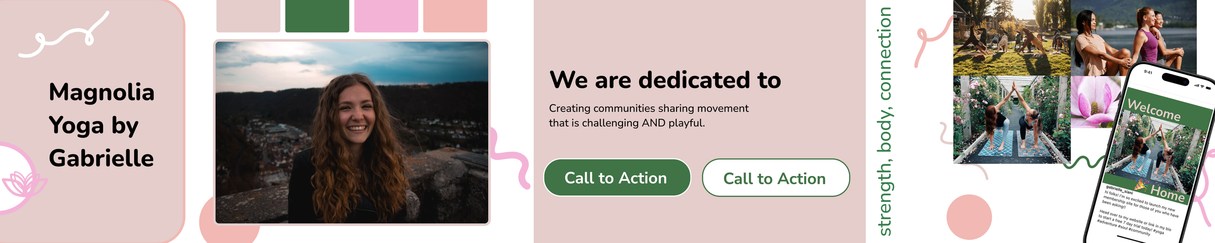
Stylescape 3: NOURISHING YOUTH
Still gives a playful take but with softness, creating a calm and nourishing presence.
Gabby loved the second (to her surprise) and third (not to her surprise) visual directions.
From the second style, she loved:
The geometric edges and shapes
The youthfulness
How it embodies what people feel when taking her classes
From the third style, she loved:
The soft edges
The femininity
The calming colors
Based on her feedback, I created a new visual identity direction.
Iteration on visual identity
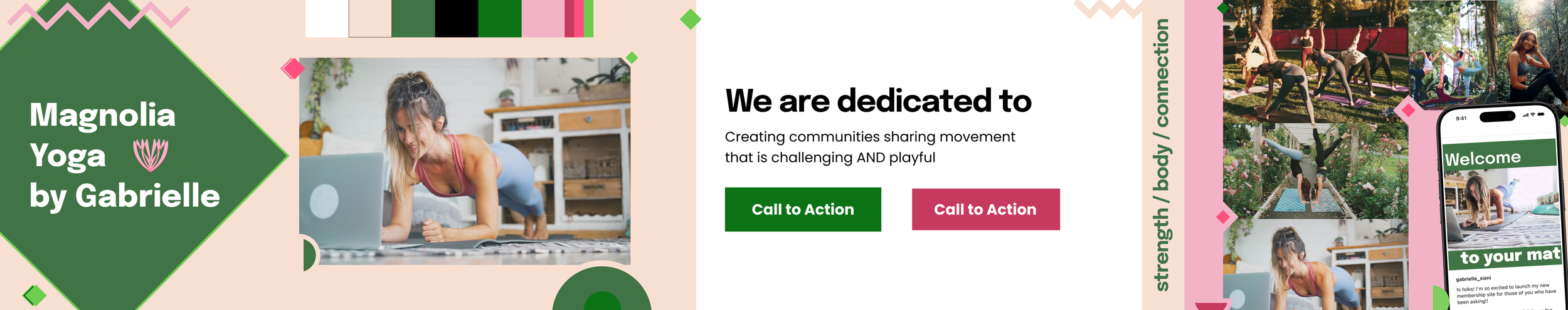
Final Stylescape: SOFT & ENERGIZING
Provides the fun, energetic feel in smaller doses, while keeping a grounding effect with soft, feminine colors.
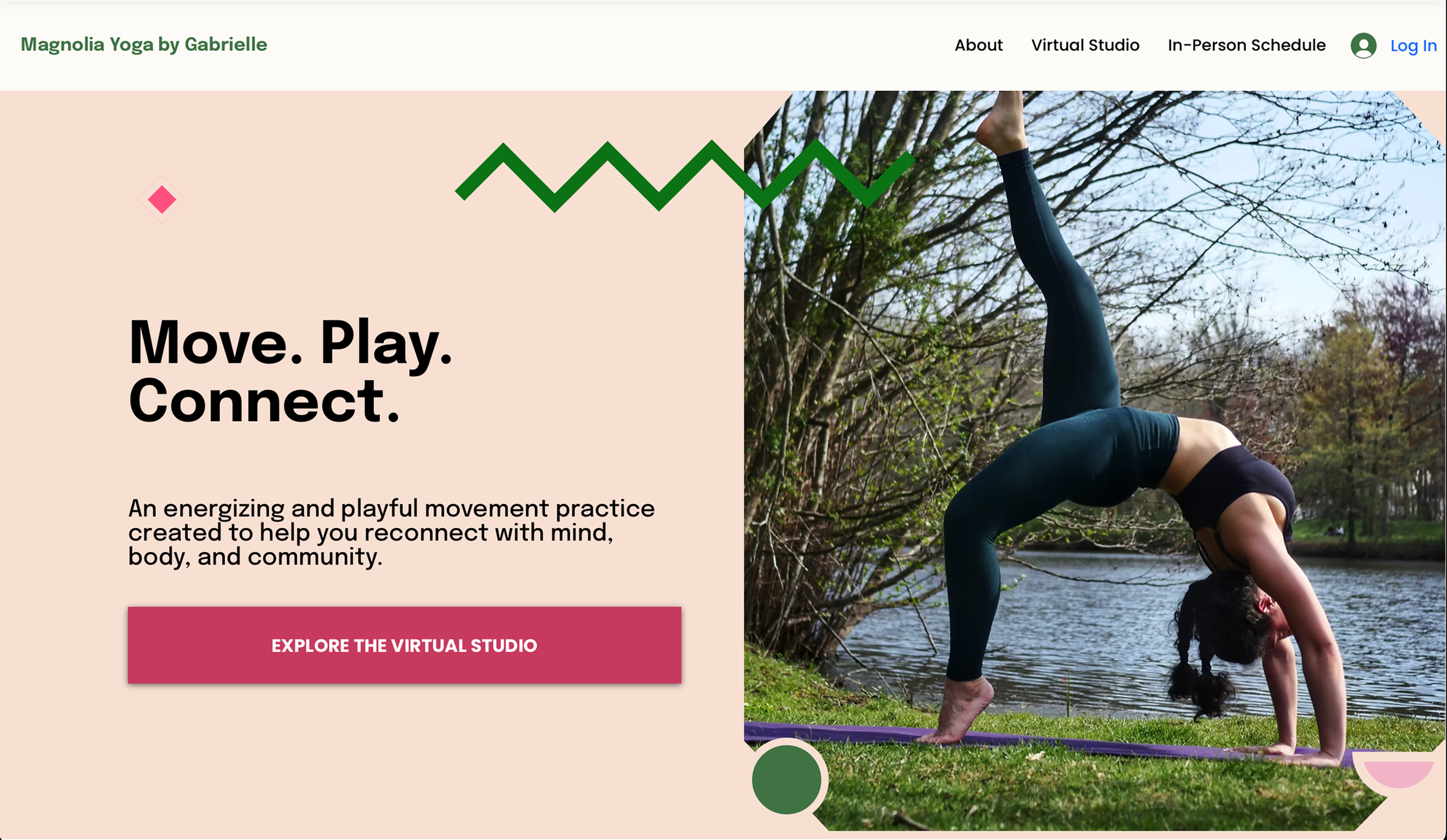
DESIGN
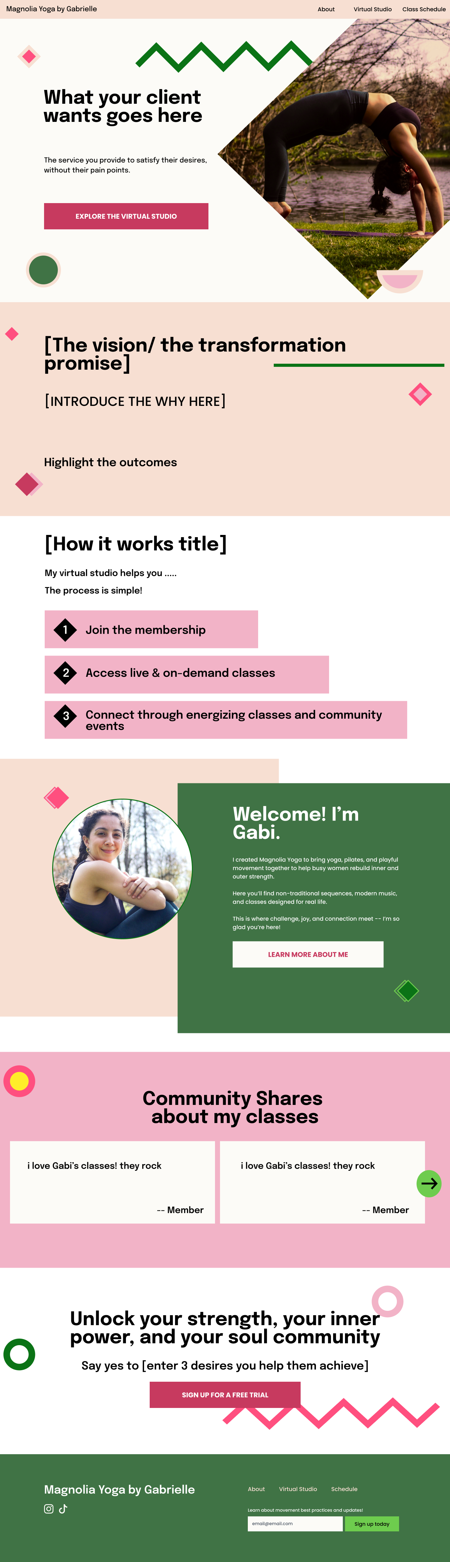
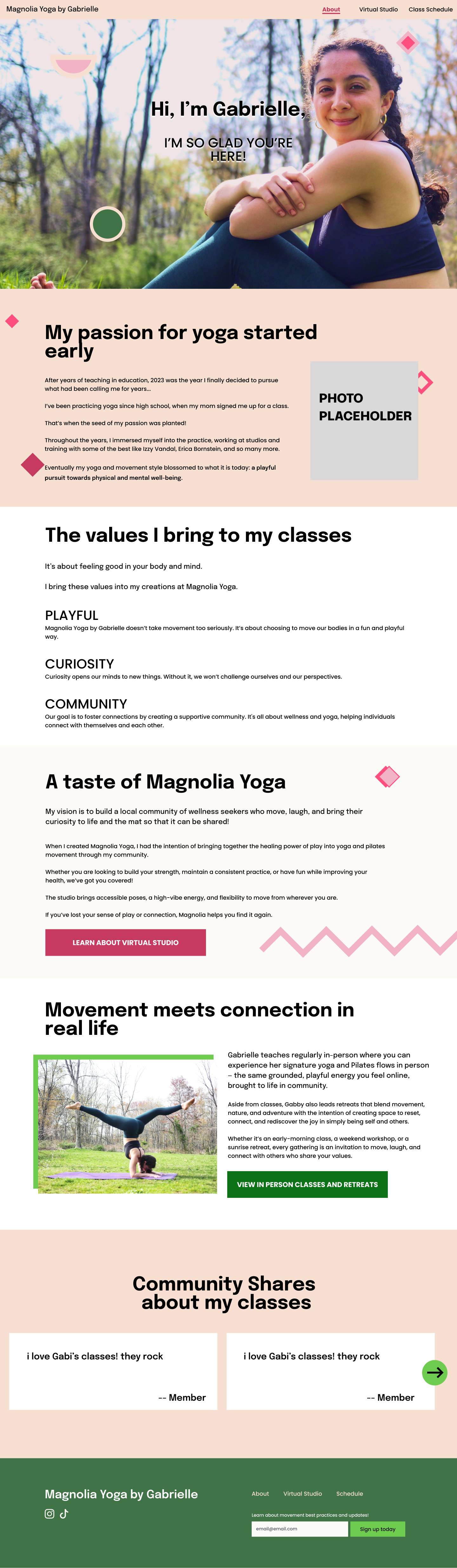
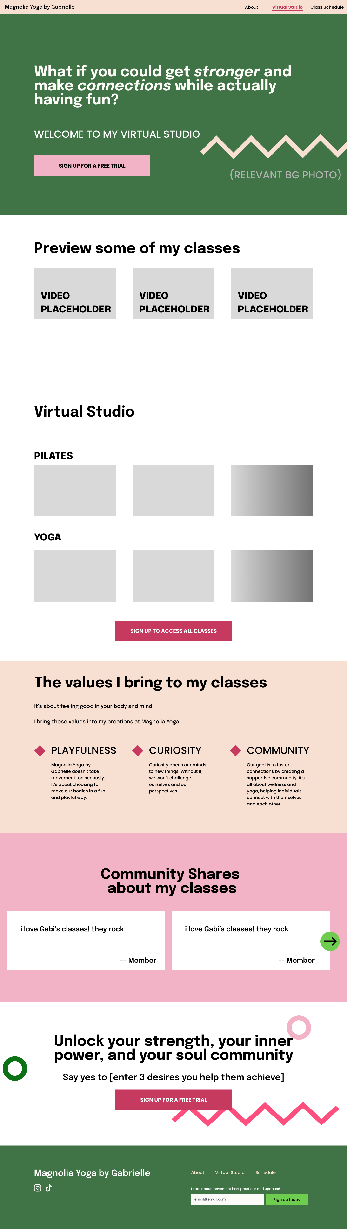
Once the visual identity was complete, I started the web design phase.
One of the key metrics for success was conversions.
Because of this, I spent a lot of time on developing the storytelling arc and copy prior to wireframing website layouts.
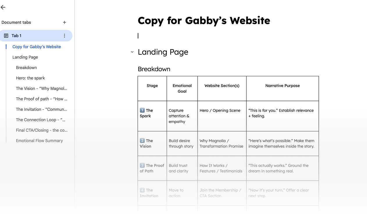
Once the copy was solidified, I began wireframing to connect design flow with the copy.
BUILD
I started building the website after wireframing
I started building on Wix studio and iterated the designs as I saw fit to incorporate the brand themes we’d developed in the first phase.
Short video walkthrough of website built on Wix Studio.
I stayed true to the brand in the experience, using animations that had both energetic and grounding effects.
Summary of Design Impact
🎨 Created branding visual identity assets for a first-time business launch
💸 Designed and built a website to promote first-time offers with conversion metrics in mind
🚀 Coached the business owner in design + strategy, facilitating direction of her offers and online presence
REFLECTIONS
Learnings and skills used.
This was the first time I worked on a brand visual identity for a client, and it was a fun experience.
Branding is more than just colors and graphics. It’s about showcasing an entire essence digitally, including voice, messaging, and even interactions and animations.
Playing with color choices and typography were my favorite part.
I also had to guide my client throughout the process, since it was her first time working with a designer and launching her business. I prompted her to think about her unique selling proposition, her competition, and why she does what she does.
Overall, there’s always more to learn — and I look forward to continuing honing my craft (a neverending journey!).
P.S. As my client develops her pricing model and officially sharing her website, I have yet to report conversion rates. I’m staying tuned to get that data.