Bloomberg LP
Redesigning Portfolio Cash Flows
MY ROLE
UX Research
UX/UI Design
SCOPE
Research, Design
Build support
TOOLS
Figma
Camtasia
Bloomberg LP is a financial software company providing data and other services to financial institutions and investors.
The Portfolio & Risk Analytics product provides institutional portfolio managers transparency into their portfolio’s performance, characteristics, and risk so that they can make better decisions based on their portfolios’ goals.
Project Overview
Context
The Portfolio Risk and Analytics product was undergoing a large migration effort. This effort, from a legacy solution to an enterprise product, meant that enterprise and non-enterprise users were coming together to use one product solution.
Problem
A better experience was crucial for user migration, alongside feature parity. This was key to facilitate resistance in users migrating. We needed to understand and resolve existing pain points and identify opportunities to improve the current experience in order to speed up user migration.
Goal
Our goal was to create a better experience so that users can migrate to the new product with little effort. We needed to create a product that allowed clients to seamlessly transition their existing workflows to the new solution.
Impact
Case Study
DEFINE
Understanding business and user goals
Goals of the project
Two product managers owned different aspects of the Portfolio Risk & Analytics Cash Flows product. I met with them to learn about the user needs and discuss their goals.
The goal and scope of this project was to:
Facilitate user migration from the old to the new interface (main priority)
Resolve existing pain points in the current experience
Identify opportunities that have potentially been overlooked
User Goals
Based on our conversation, I understood that users have the following motivations for using the cash flows functionality:
Determine whether they are above/below their mandated cash threshold, for example, when simulating trades
Make sure they have enough cash to pay for their liabilities
User Flow
I created user flows to better understand and empathize with users.
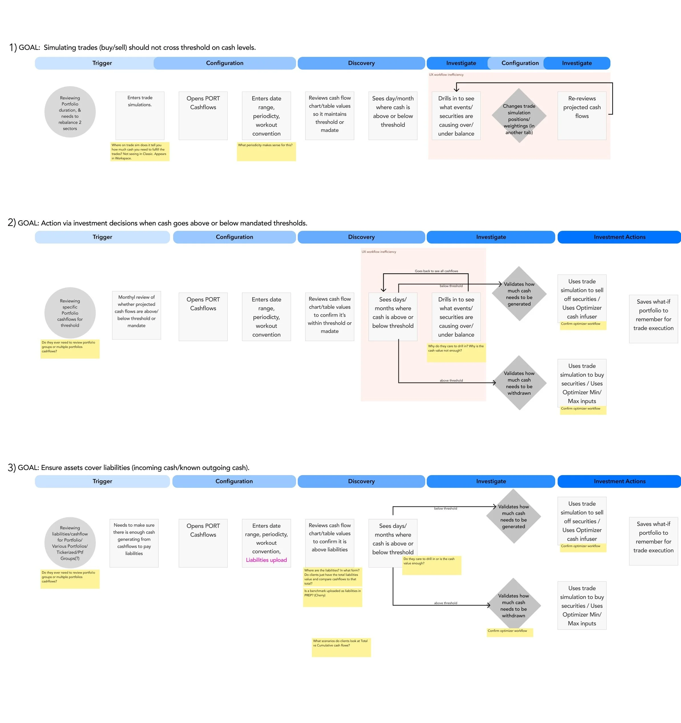
I found there were some experience inefficiencies — noted in the flows with a light red background style). There were also some open workflow questions that needed clarity—marked in yellow sticky’s in the diagram.
In addition, the pain points were not clear from Product’s perspective.
I received product buy-in to proceed with user research in order to better understand the user needs, pain points and usability problems in order to improve the experience of using this functionality within the new interface we were going to migrate users to.
I kicked off research to understand if there were unaddressed pain points and opportunities.
IDEATE AND VALIDATE
Research kick-off
Methodology
Contextual inquiry and concept evaluation.
I created wireframes with new features to be validated (concept evaluation) based on my understanding of user goals. These features included cash guardrails and trade simulation features and a change in layout and navigation.
Research Goals
1. Contextual Inquiry
Understand the current workflow & journey of cash flows
What information is important when viewing cash flows (i.e. configuration)? When/why do they prefer to use the table vs. the graph?
What are the triggers for drilling into cash flows?
When they are drilling into cash flows, what data do they need to see?
What are their next steps after viewing cash flow?
Are there opportunities to integrate other workflows into this one (e.g. trade simulation)?
Uncover any unmet needs or gaps
2. Concept Evaluation
Does the client prefer the new layout and information structure?
Are cash threshold guardrails (new feature in wireframe) useful?
Is there a need to compare simulated portfolio cash flows and adjust positions to view how it affects cash?
Wireframes used for research study
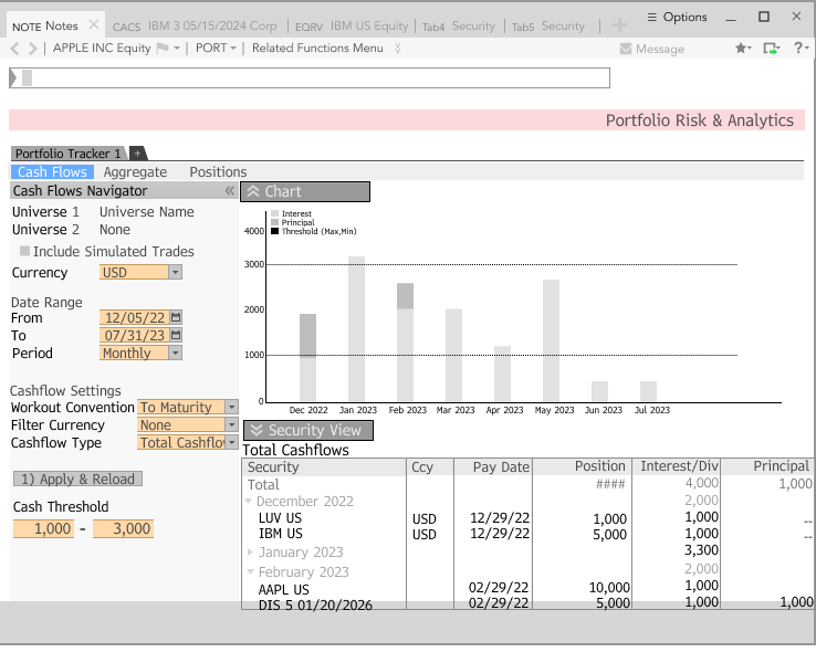
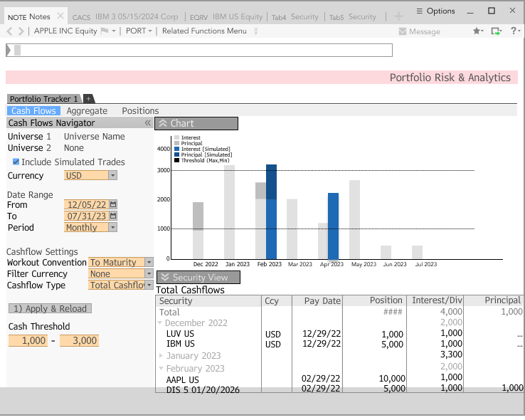
Portfolio Cash Flows
Simulated Portfolio Position Changes
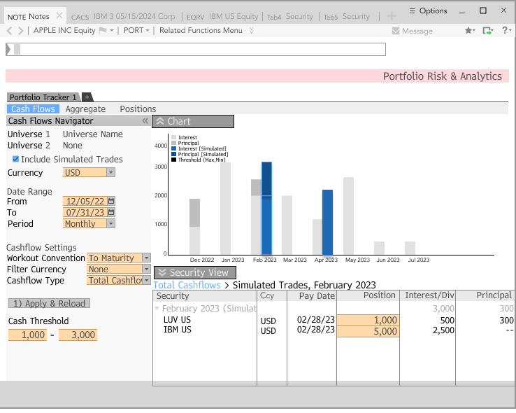
Simulated Portfolio Comparison
With the help of the UX operations team, I recruited 8 participants for this study.
5 Portfolio Managers
2 Operations Fixed Income Managers
1 Asset Owner
Key Findings & Takeaways
Contextual Inquiry Takeaways
Clients’ most used configurations were uncovered, helping provide direction to which defaults should be used in the new interface.
There are grid usability issues, such as a lack of a filter row, in the current experience, resulting in poor search capability.
The radio button toggle from ‘Graph to Table’ radio was not discoverable (usability problem).
The chart does not contain tooltips, users would want to confirm cash flow values.
Concept Validation Takeaways
All participants gave positive feedback on the new layout of the screen which exposed the aggregate and holding level views together.
Five (out of 8) participants either did not find cash guardrails useful nor did not demonstrate confidence on how they might find it useful.
Five (out of 8) participants did not find the cash flow comparisons between the current and simulated portfolio useful for their workflow.
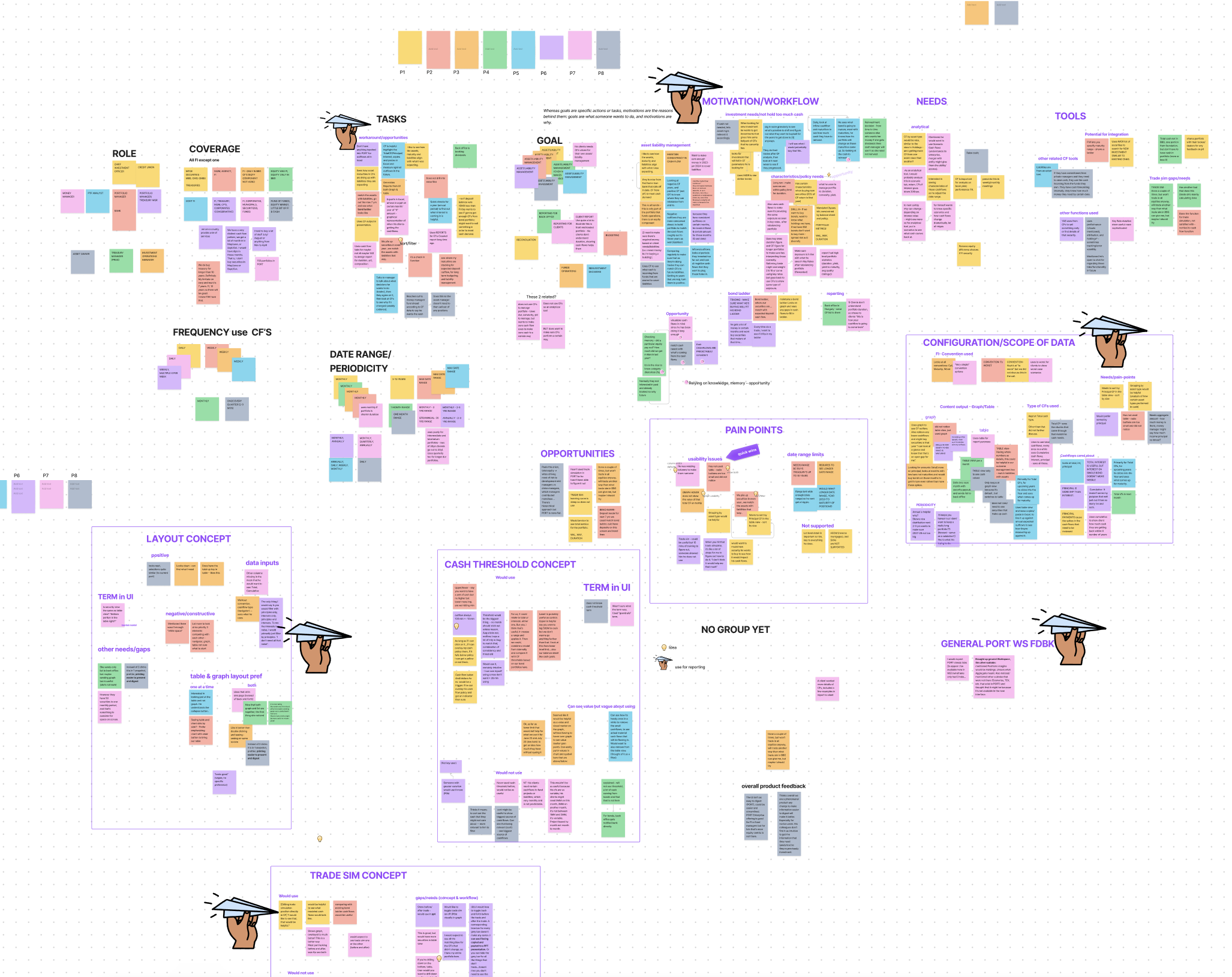
Affinity Mapping exercise image outlining my organization and focus
Given the nature of this project, I delivered immediate improvements to the product experience in addition to creating a roadmap on future improvements.
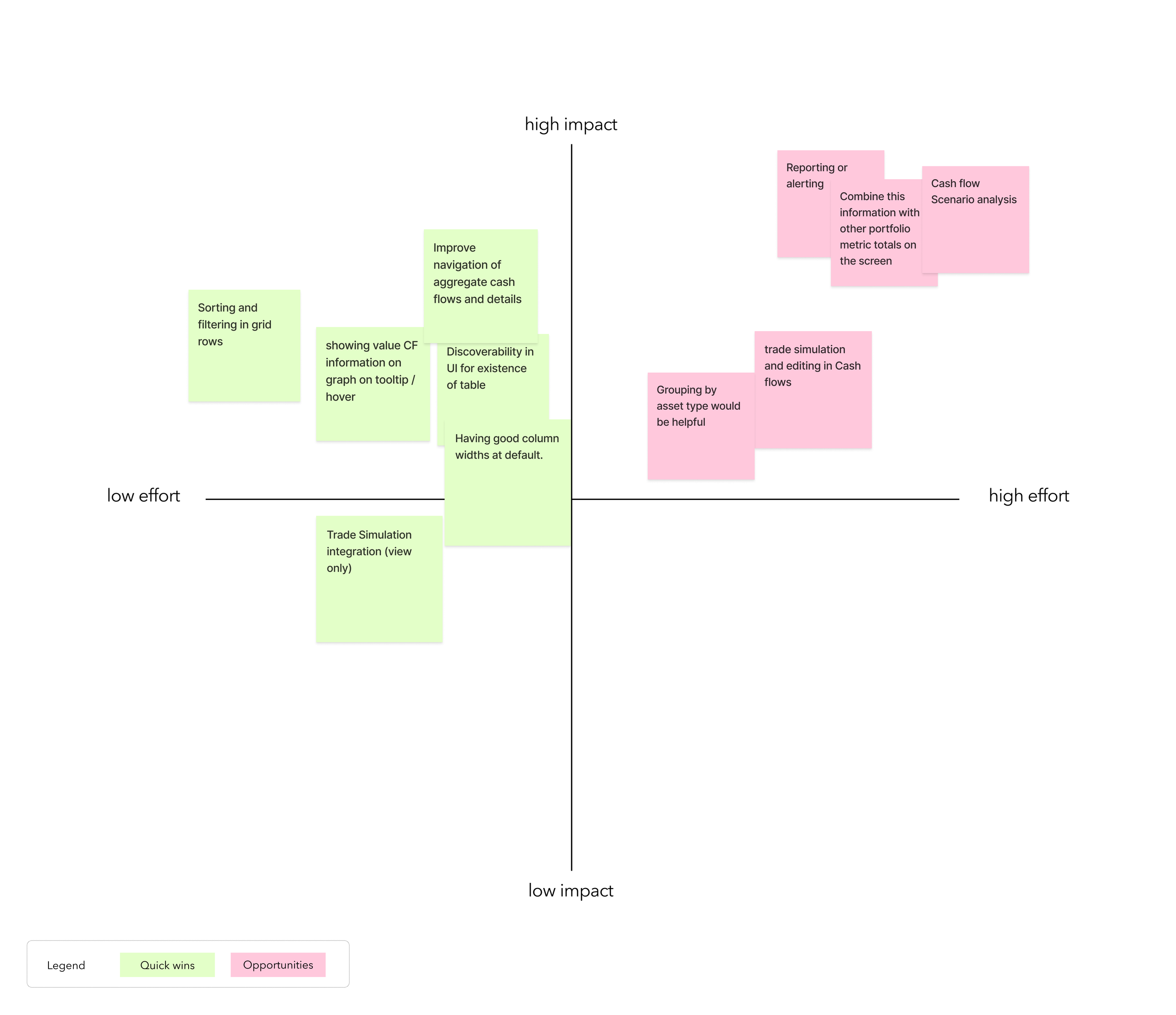
A Quick Wins and Opportunities chart
We focused on Quick Wins for the current migration build, and a list of opportunities that can be considered for future iterations.
Quick wins = green post-its
Opportunities = pink post-its
I aligned on these with Product and Engineering teams.
After alignment with stakeholders, I finalized the wireframes and provided a high fidelity wireframes to the engineering team.
DELIVERY
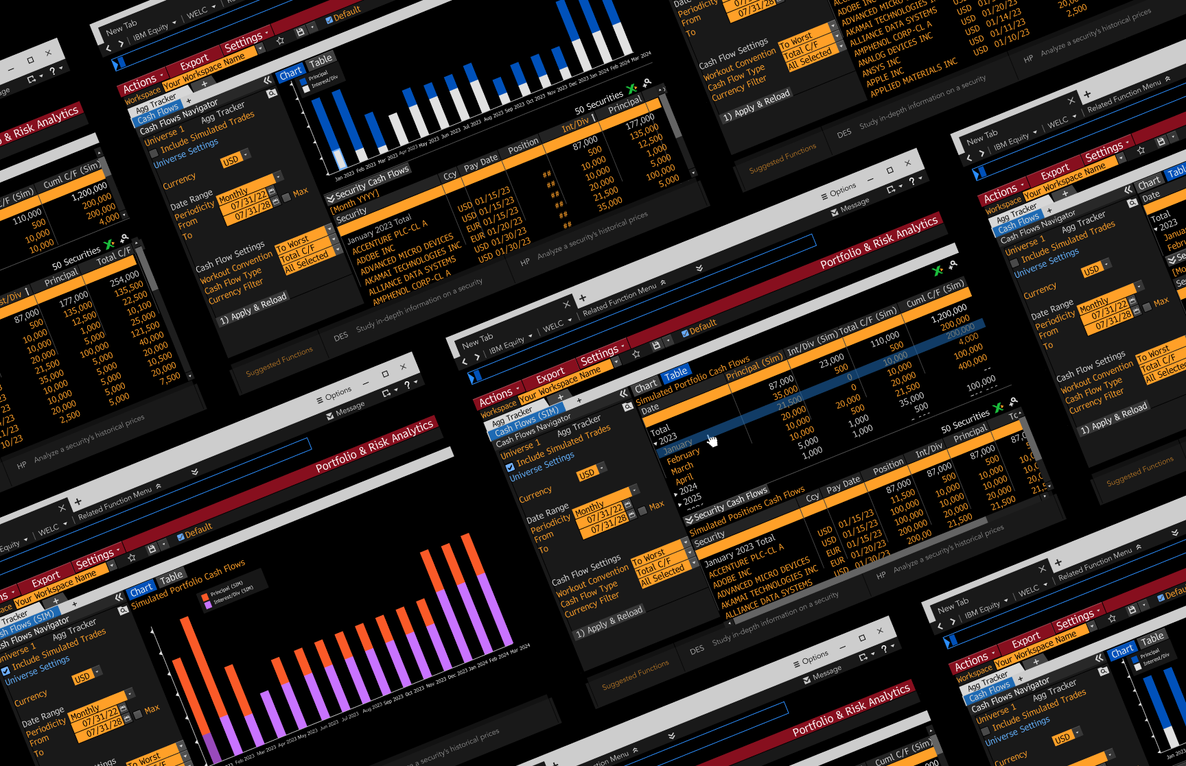
Delivery of high fidelity designs
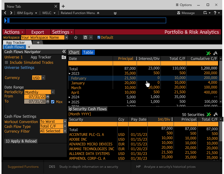
A graph view outlines total cash. The design showcases the improved workflow of seeing the underlying securities that make up that cash distribution on the same screen for ease.
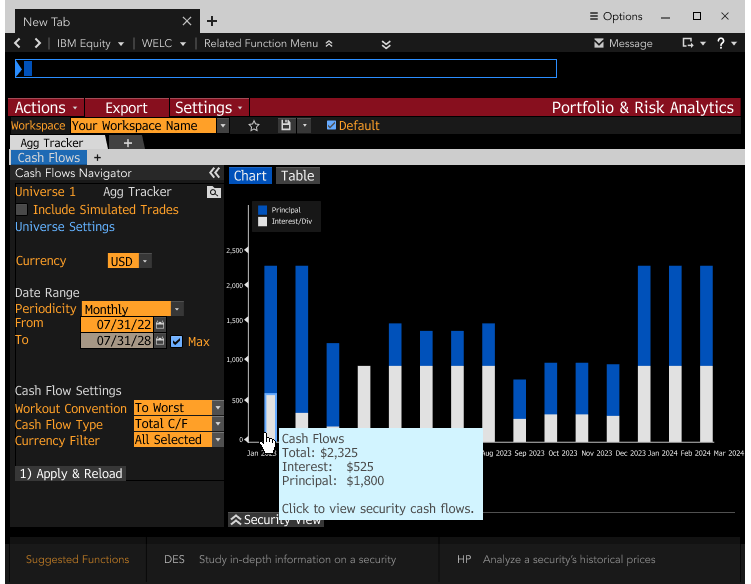
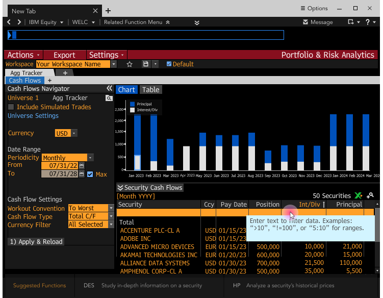
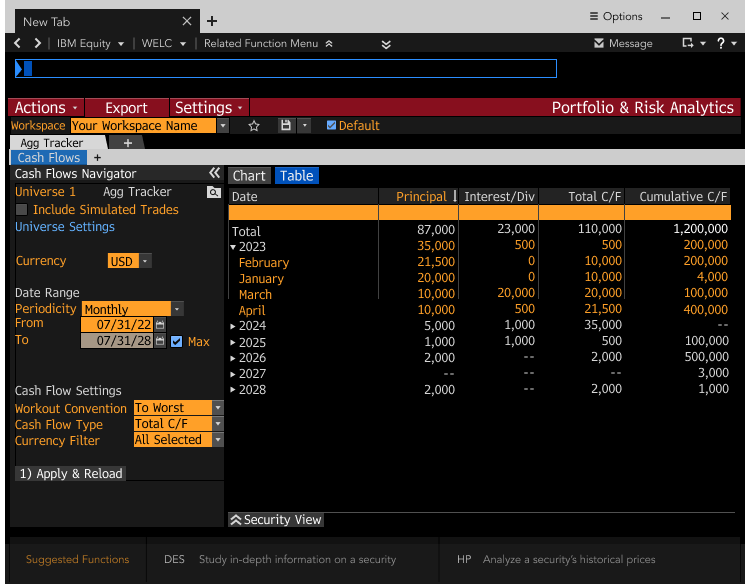
We added a table view to support feature parity with the same improved interaction of seeing details easily on the same screen.
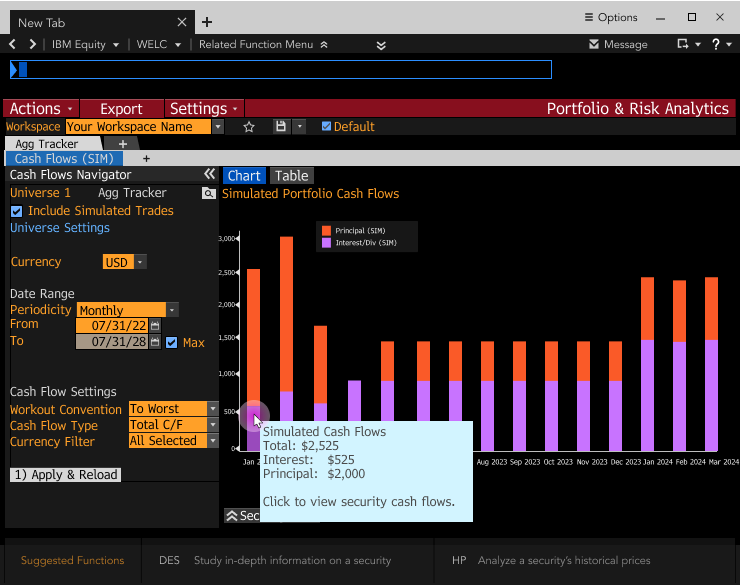
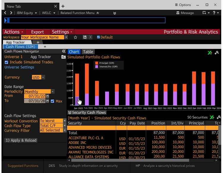
Provided the ability for clients to view simulated portfolio aggregate cash flows chart view and interaction. Since there was no need to see current and simulation side-by-side, we simplified the delivery.
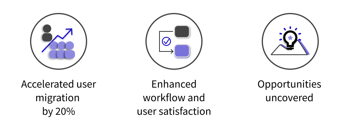
Impact
BUILD SUPPORT
Partnered with engineering to ensure quality of designs were met
Post design delivery, I worked on ensuring elements were implemented during the build support phase.
While we had uncovered some opportunities for improving the function, I also worked with the engineering team to instrument certain attributes in order to collect analytics, since instrumentation does not come for “free” with the widgets. Obtaining the data can lead to other insights that we can follow up on, as needed, when iterating the product in the future.
REFLECTIONS
What I learned. Skills I used.
What I learned from this project was that—given the migration goals and timelines—striking a balance between following best practice design processes and maintaining contained project goals is important.
Speaking with the users allowed me to consider the question of what we do now versus the future, a quality I typically bring to all my projects. Though it was helpful to gauge what product vision and direction we could consider as a team, we might have arrived at a similar outcome with less upfront diligence.
This taught me to have greater discernment between striking a visionary and/or tactical approach in the projects I work on.