Cool Culture
Enhancing Member Experience
MY ROLE
UX Research
Interaction Design
Visual Design
SCOPE
6 weeks
Mobile app
3 other team members
TOOLS
Figma, Adobe Xd
Cool Culture is a non-profit organization that partners with local organizations, such as schools and cultural institutions, to connect cultural resources to families. Families who partner with Cool Culture benefit from receiving free admission to over 90 partner cultural institutions, such as museums, zoos, galleries, and historical societies.
As a team, I worked on the organization’s objective to enhance the member experience of their Family Pass card service, providing families access to cultural institutions for free. The current implementation led to little use of the Family Pass given a slow onboarding and manual process of searching for institutions to visit.
We delivered a high fidelity design that would make the members’ workflow a lot more seamless, with the hypothesis that this would ensure more members use the Family Pass service.
This project was completed as part of one of my Masters in Information Experience Design courses taken at Pratt Institute.
Brief
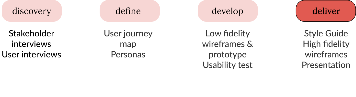
Our Process
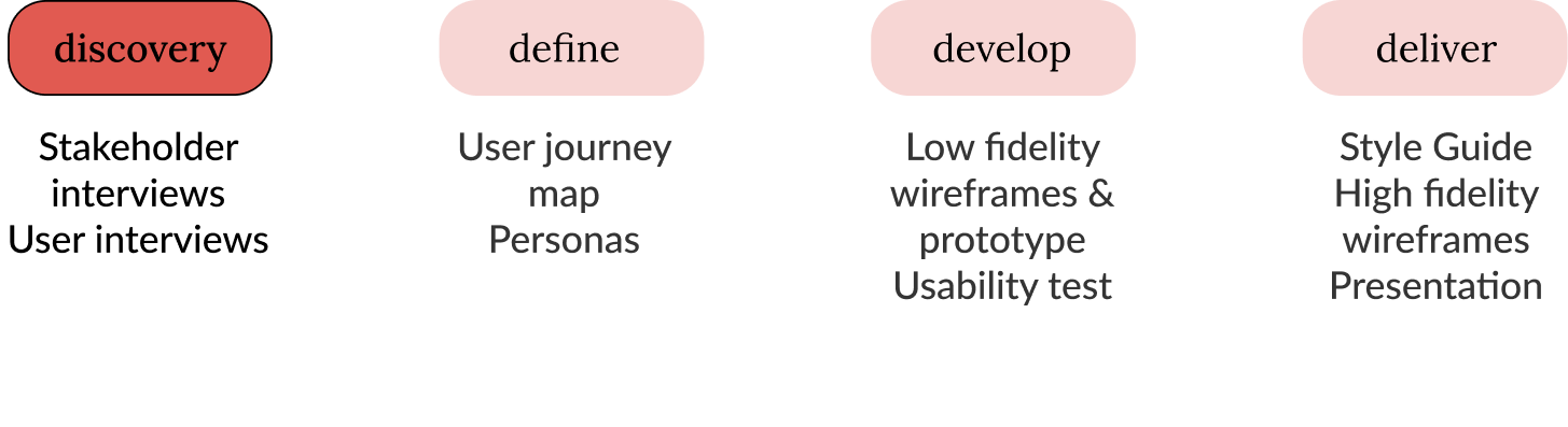
Discovery
Stakeholder Interviews
We met with Cool Culture’s Director of Programming and the Program Manager to understand more about the organization and their main offering, the Family Pass Program. We identified the pain points from the organization’s perspective. Their focus was to go digital for the following reasons:
Facilitate the level of community engagement
Centralize the database of available cultural institutions
Provide users the ability to reserve an appointment in order to facilitate and engage them in visiting cultural institutions, given the recent COVID-19 pandemic challenges
Research Goals
What factors influence families to get excited about moving forward with onboarding as members of Cool Culture?
How can Cool Culture facilitate further social connection and belonging between members?
What bottlenecks does language pose on how information is accessed and navigated, and how can these be overcome?
What is the most constructive way for institutions to receive, collect, and implement feedback?
Define
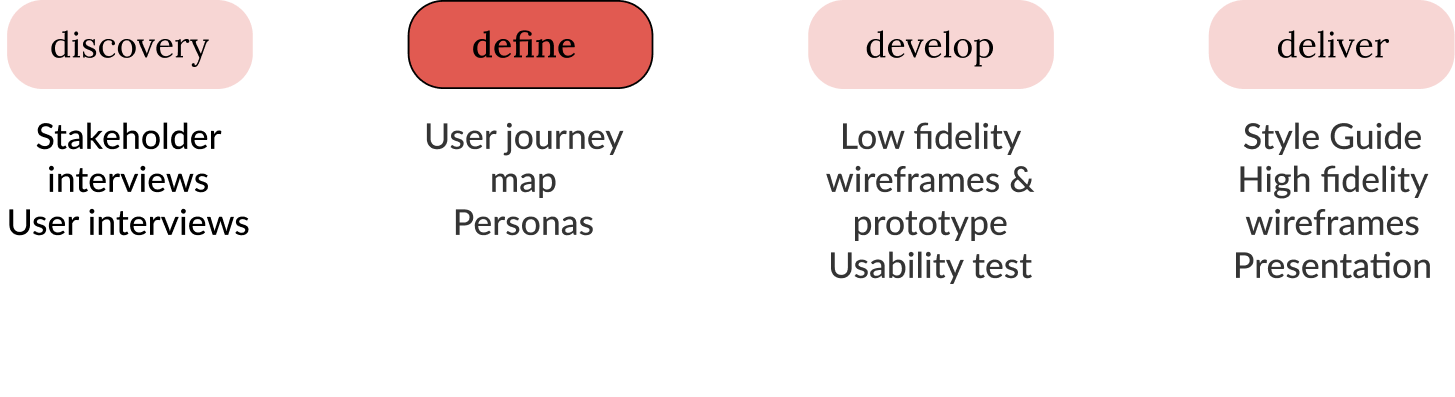
User Journey Map
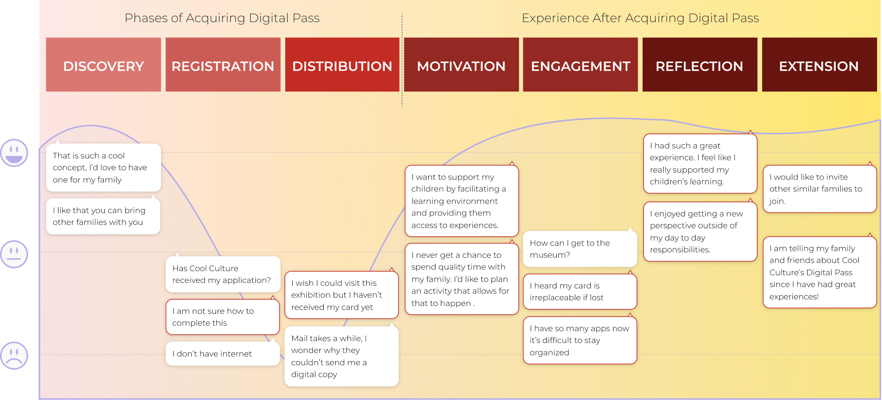
Key Insights & Takeaways
The current manual process with registration and distribution of the family passes delays the users’ excitement for the benefits of using the pass.
There is difficulty finding what institutions partner with Cool Culture, therefore users are unsure where they can go for free.
Unfortunately you don’t get an email confirming receipt, or email confirmation that they [Cool Culture] received an application.
Users’ engagement with cultural institutions differ in terms of what motivates them.
At the Brooklyn Children’s Museum. They [the kids] get to run around to be themselves. I don't have to watch them that much.”
Given the feedback, we focused on designing for discoverability of institutions that are free and the ability to book a reservation directly from the app. Though we discussed that registration would also be done through the app, the wireframes did not include this.
Develop
Low Fidelity Wireframes
Upfront information about reservations, added museum checklist, and “Add to Calendar” feature.
Flow Iteration
Key Features we focused on were
Flow Ideation

Usability Test & Findings
We ran a moderated remote user testing study, and tested three (3) target users, a stakeholder, and a proxy user.
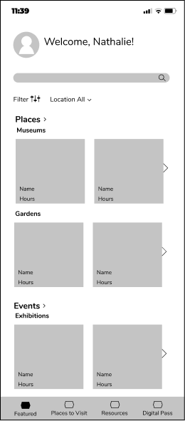
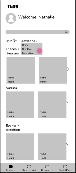
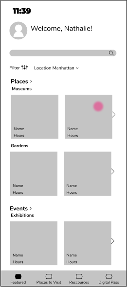
Dashboard
The landing dashboard had content that did not seem mutually exclusive.
Nearby feature was not used within the dashboard.
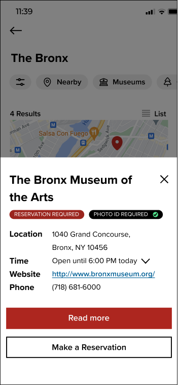
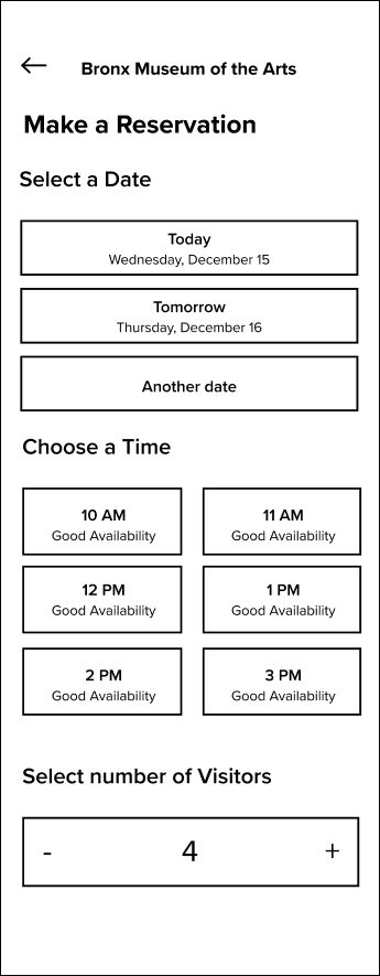
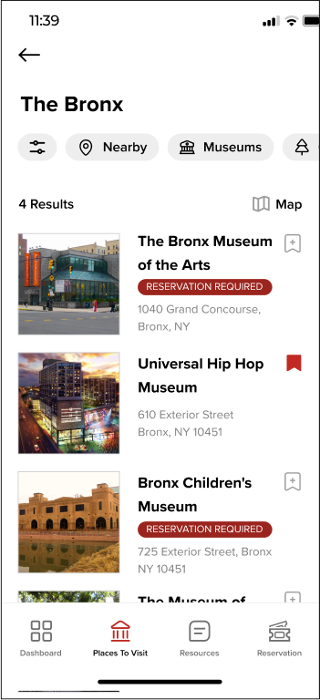
Reservation Flow
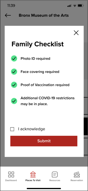
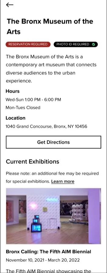
Useful information was missing on the reservation flow, such as: ID requirement, opening hours, additional fees for exhibits
Digital Pass
Users had a hard time finding reservations from the Digital Pass tab
We needed to think about a solution for users to access the digital pass for institutions that don’t require a reservation
Deliver
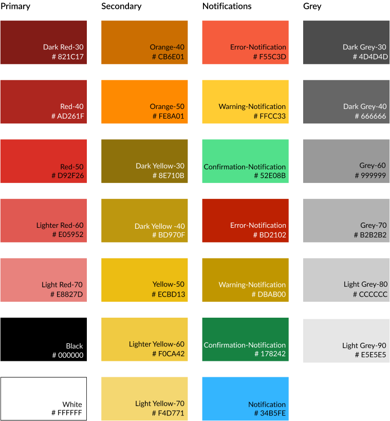
Style Guide
We created a cohesive guide in order to create consistent wireframes to the current brand.
Font Specification

Color Palette
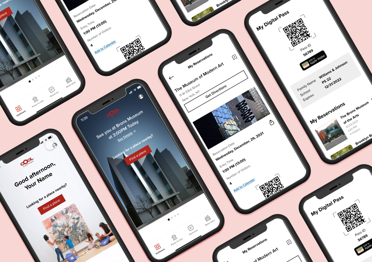
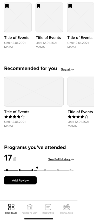
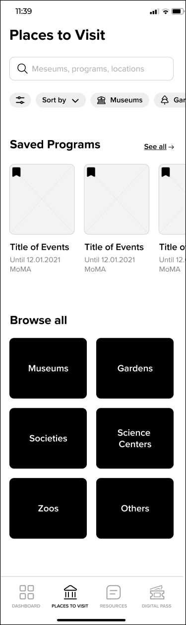
High Fidelity Wireframes
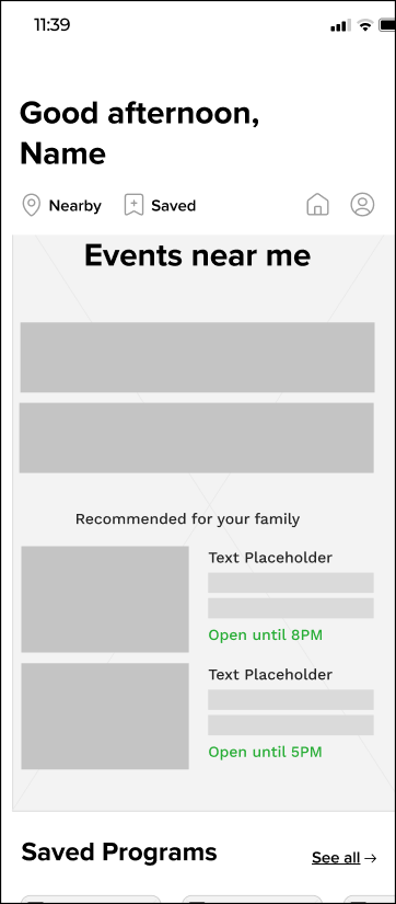
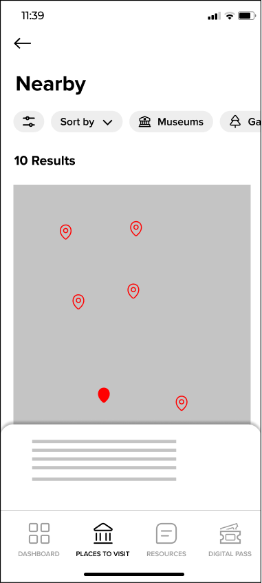
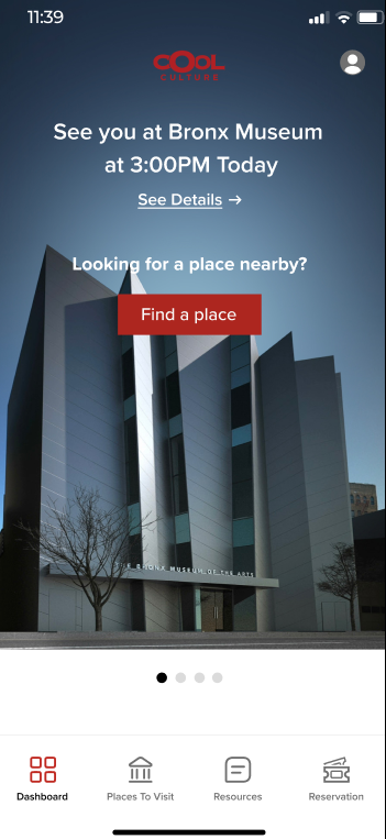
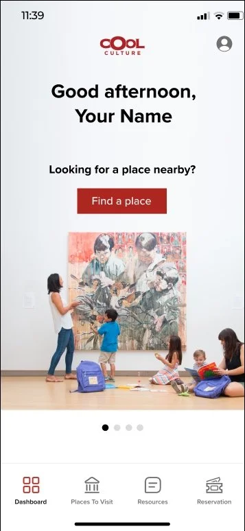
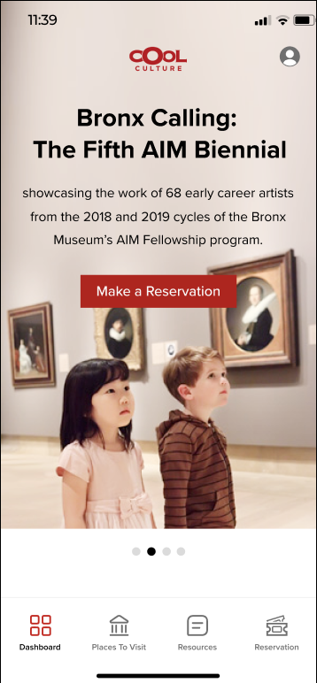
Dashboard
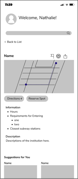
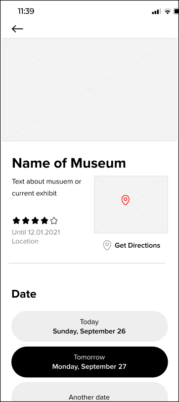
Reservation Flow
Layout Guide
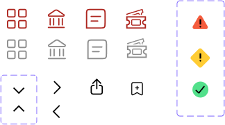
Navigation Icon Set
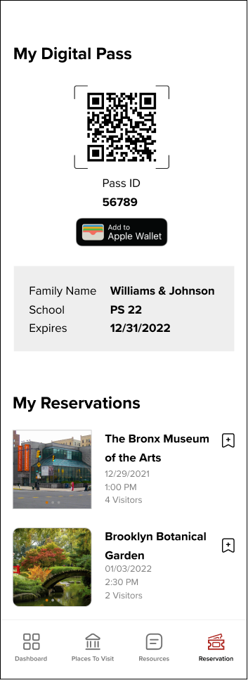
Better CTA for the “Nearby” feature, making a reservation, and personalized reservation information.
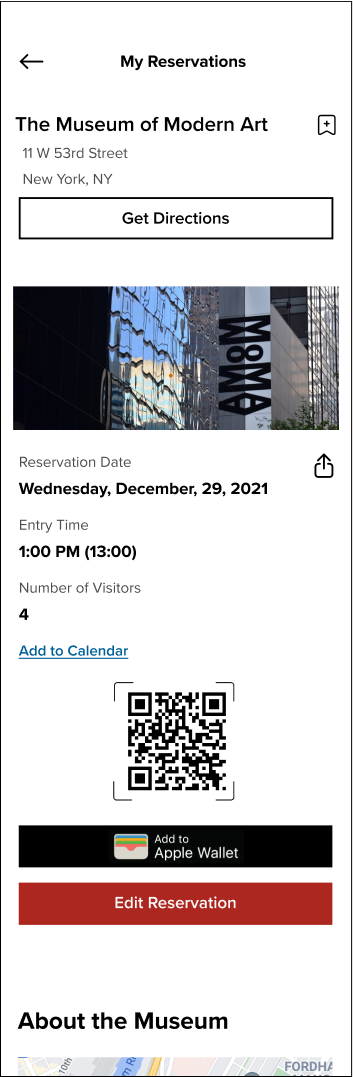
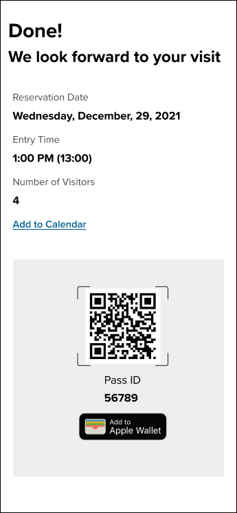
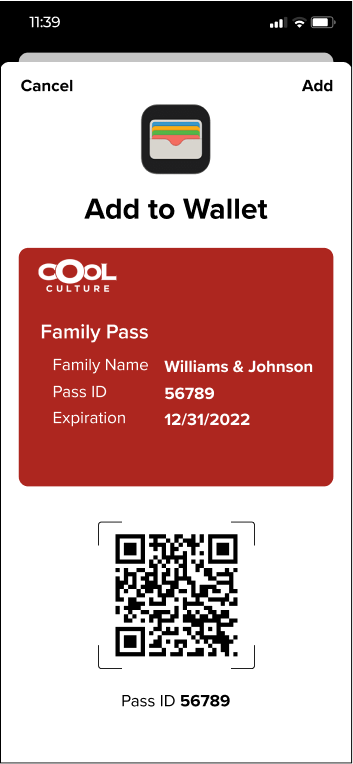
Easily accessible QR code for presenting upon arrival, “Add to wallet” capability, edit/cancel reservations
Accessing the Digital Pass
Final Thoughts
Our stakeholders were very pleased with the solutions we shared in the mid-point and final presentations. They expressed that the proposed solutions hit key pain points that they were wishing to address. They were appreciative of the team’s resources on assisting them with the organization’s challenges.
If I were to do this over again, I would have focused on the registration UI and workflow since it was one of the biggest pain points and is important to address, despite being technical or data oriented.