Travel Unity
Improving Website Experience
MY ROLE
UX Researcher
UX Designer
SCOPE
6 weeks
Desktop, website
3 other team members
METHODOLOGY
Usability Testing
TOOLS
Figma, Google suite products
Travel Unity is a 501(c)(3) nonprofit organization whose mission is to establish and foster DEI standards across the travel industry through educational programs that intersect with both travel industry professionals and any individual who engages in travel (travel is defined very broadly by Travel Unity: it encompasses everyday contexts, including commuting to work). Notably, Travel Unity has a robust range of youth programs. One of its core audiences is young people seeking educational opportunities, as well as parents and counselors who support and advise young people on these opportunities.
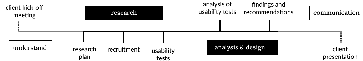
As part of Pratt Institute’s Usability Theory & Practice course, I participated in a usability test with three other student researchers. Our group of usability researchers met with Travel Unity’s Executive Director Roni Weiss and Youth Coordinator Elijah Washington to learn more about their goals. The organization wanted to understand whether the website users had all the information they needed in order to drive more engagement.
Our goal was to evaluate pain points of the current website to provide recommendations to improve design issues found in the data. We laid out a research plan with the following goals: discover usability issues with navigation; discover pain points in finding information; understand exactly what information users seek from the website. Our audience focus was on the parents of young people who sought educational opportunities.
Brief
This was our process
Research Goals
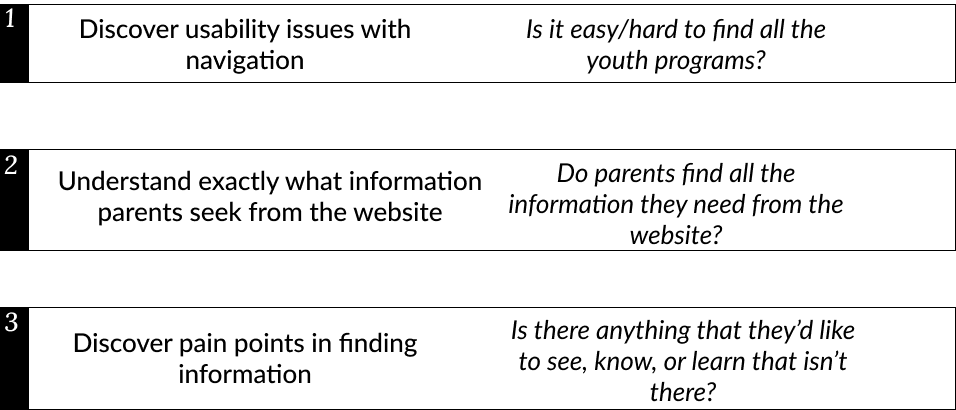
Our research goals boiled down to usability issues, information seeking needs, and other pain points related to content.
Our plan was to conduct a moderated remote usability test to explore these questions with a series of scenarios and tasks. Our methodology included meeting participants remotely via Google Meet or Zoom, spending approximately 30–60 minutes with each participant as they walked through a series of predefined tasks and thought out loud during those tasks.
We had to tweak our recruitment process to get enough participants for our study.
Our first round of recruitment used Travel Unity’s existing contact database of parents whose children are already involved with the organization’s programs and drew one participant. Because of a lack of engagement, we reached out to an extended social networks and online communities, using a screener survey.
We were able to recruit 7 more participants, for a total of 8 participants.
Initially, we had planned to reject all respondents without children or parents with children under 13. We ended up expanding the age range to 11–20 in order to recruit enough participants in a timely fashion. The parents of slightly younger children should reflect parents who could be interested in Travel Unity’s programs in the next few years.
So that we were finally able to conduct our usability test
We spoke with a total of 8 participants.
We conducted a moderated remote user test over Zoom or Google Meet that ran over a range of 30-60 minutes long.
The discussion included:
Pre-test questionnaire
Scenario and tasks
Post-task questions (quantitative)
Post-test questionnaire
We documented user responses in Google spreadsheets, coding themes found from the participants’ responses.
Our Findings & Recommendations
We had positive feedback, and constructive feedback…
In general, the easiest tasks for users were those focused on finding specific information about Travel Unity’s youth programs and volunteering opportunities.
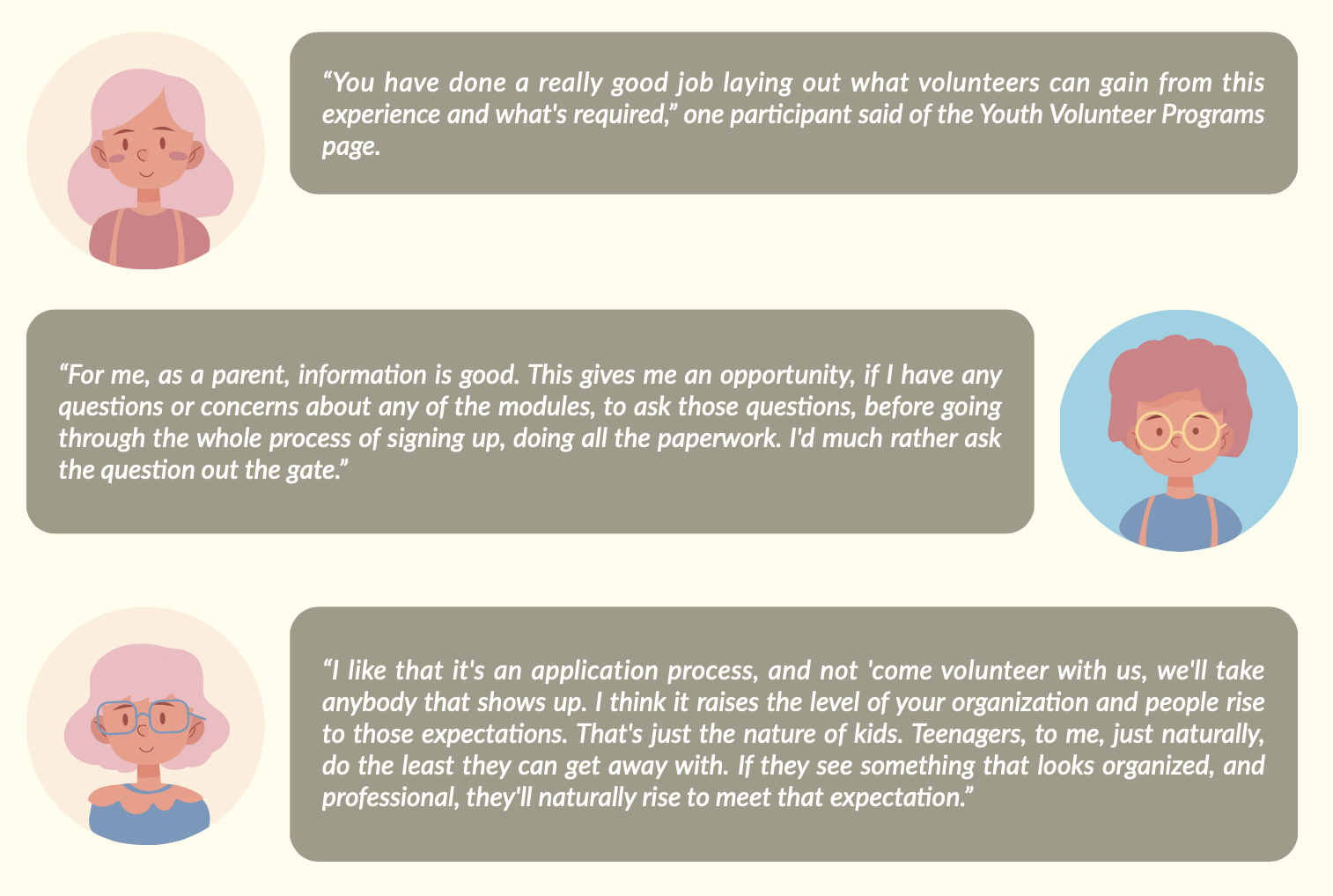
Participants appreciated the level of information available about the youth programs and the fact that an application process was required.
Most participants found the information on the youth program pages fairly quickly, and found that the broad information and assurance they needed was available.
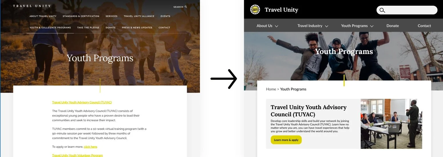
However, we believe the information hierarchy on these pages could still be more clear, and some participants felt more logistical information and examples of the offerings would be helpful.
The following detailed findings led us to have multiple recommendations directly contributing to a website redesign.
Finding #1 - People had trouble figuring out what the organization does & who it serves
Arriving on the homepage does not provide the details that would have helped users’ perceptions and understanding.
Direct Quotes:
“I’m not sure how to describe the organization from the homepage. I’m struggling with who your customer is.”
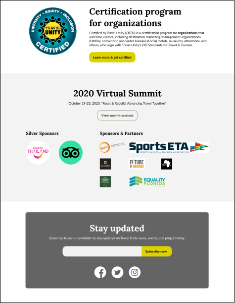
Recommendation # 1 - Redesign the homepage
Add copy to clarify the mission, vision, and audience.
Add a video to introduce more about what Travel Unity does and who it serves.
Remove the slideshow on the homepage.
Resize partner logos, and make the association with the summit more clear.
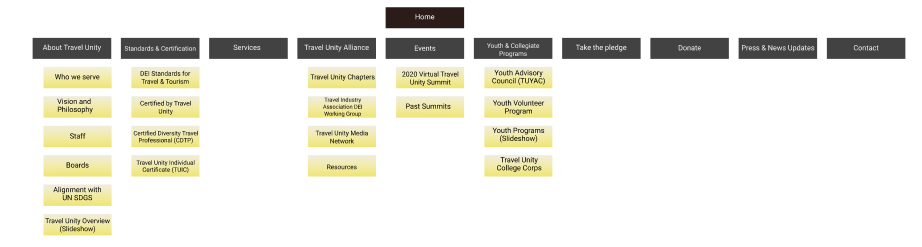
Finding #2 - Many users struggled with the navigation, from discovery to understanding the menu’s labels.
63% Could not tell that screen loaded, or that there was content under the navigation bar
50% Confused the meaning of the navigation labels
38% Missed or overlooked the labels in the navigation bar
“...like they [content in Services] are talking to an organization in the travel industry they’re not talking to parents of organizations that might travel.”
Original Information Architecture
Finding #3 - Participants didn’t understand the youth programs outcomes
Participants had difficulty unpacking the information about each individual youth program.
Some participants reported anticipating that they would find experiential, distant travel programs, as a result of their impressions of the homepage photo.
Those who arrived on the youth program pages on the program-specific pages struggled to define exactly what the programs consisted of.
“...looking for details on traveling through the program... what are the services?”
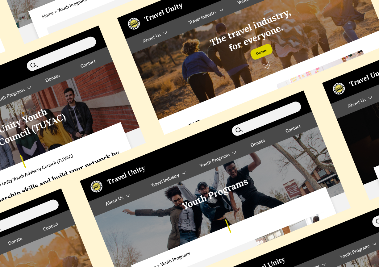
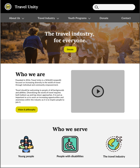
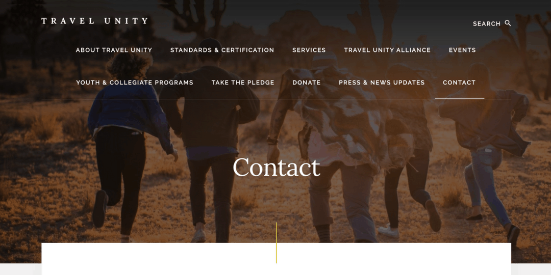
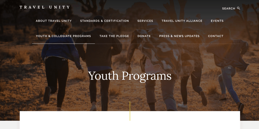
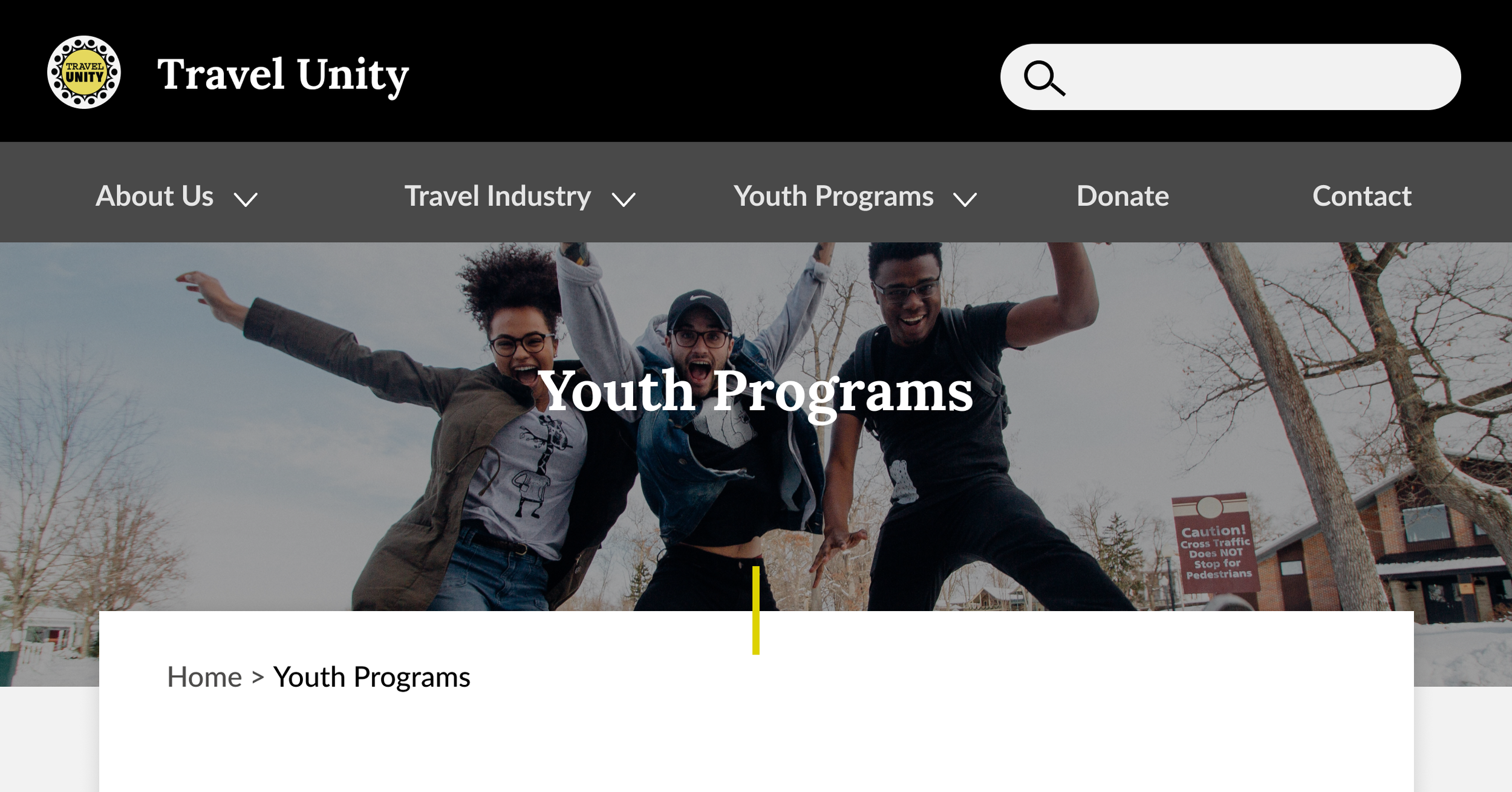
Contact Page (Before)
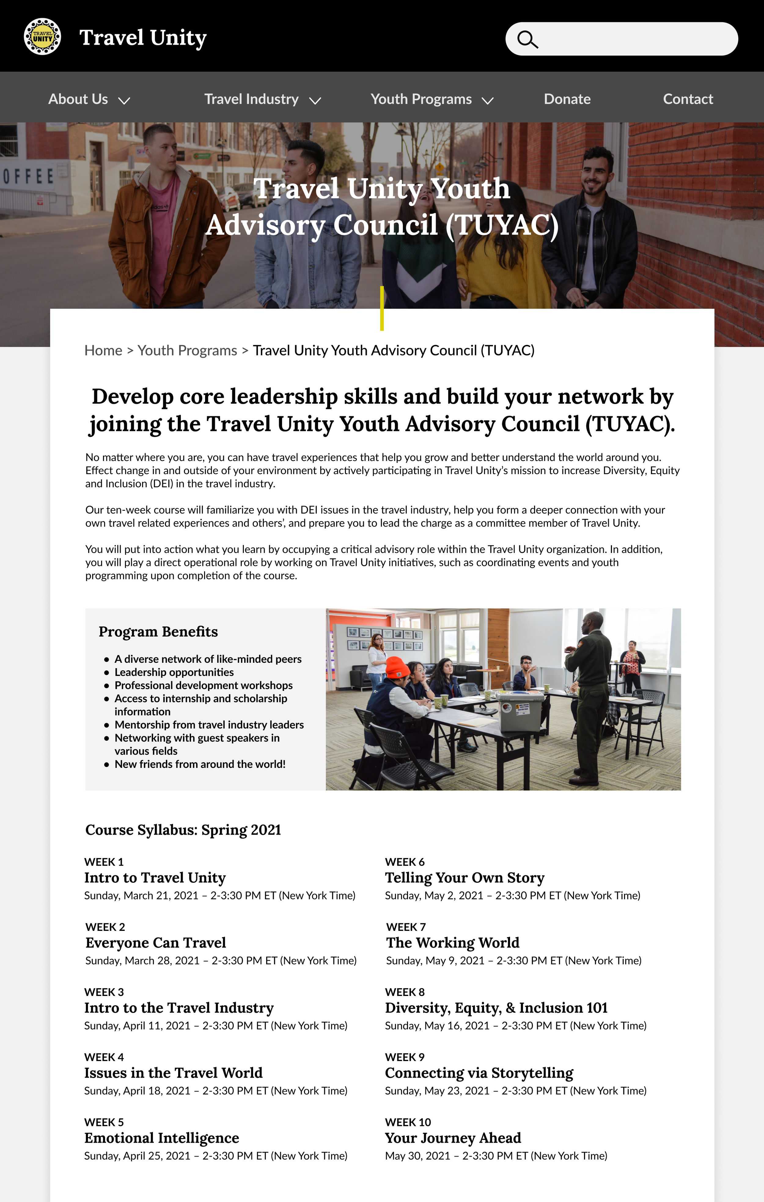
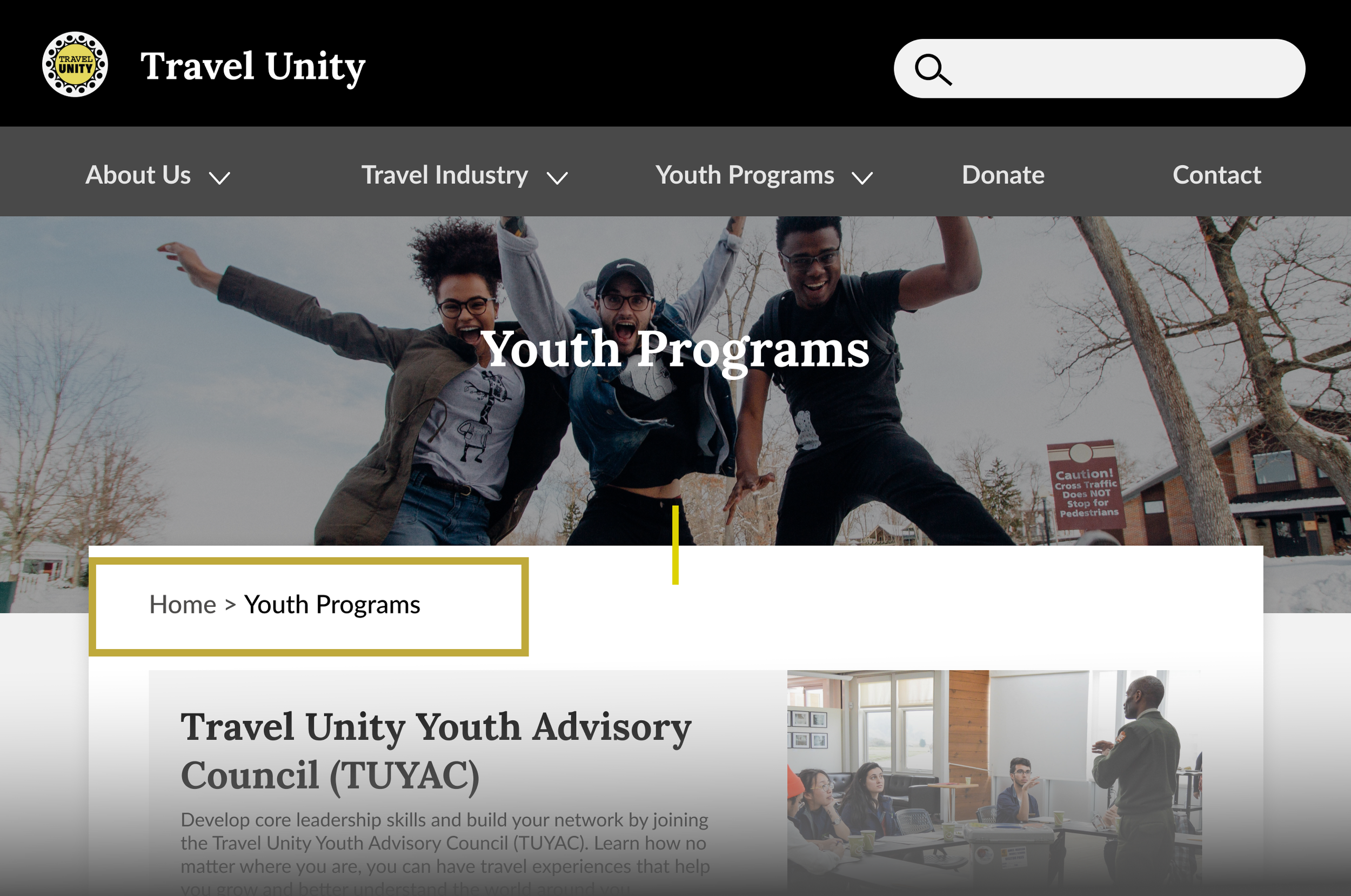
Youth Programs Page (Before)
Recommendations # 3 - Add clarity about the programs and their benefits
“I’m not 100% sure yet exactly what the group does just based on landing on the homepage.”
“Took me a while to find that [youth programs] because it’s on the second row… I looked at the top row first.”
Recommendations #2 - Improve the website navigation
Simplify the navigation hierarchy, creating one row of top level categories
Improve category labels
Add breadcrumbs to help user navigate seamlessly
Proposed Information Architecture

Breadcrumbs for easier navigation
“The page [youth volunteer program] describes ‘opportunities’ but what are the opportunities? That’s what I’m missing.”
Add photos to the youth programs’ pages that reflect the substance of the programs.
Create active voiced, introductory copy about each program in the second person to directly communicate to the user
General Design & Accessibility
The topic of websit accessibility came up during our conversations with the Travel Unity stakeholders, so we provided accessibility recommendations that could be applied to their entire website. Our recommendations particularly focused on those with color vision deficiencies.
Therefore, all of our mock ups include proper accessibility practice.
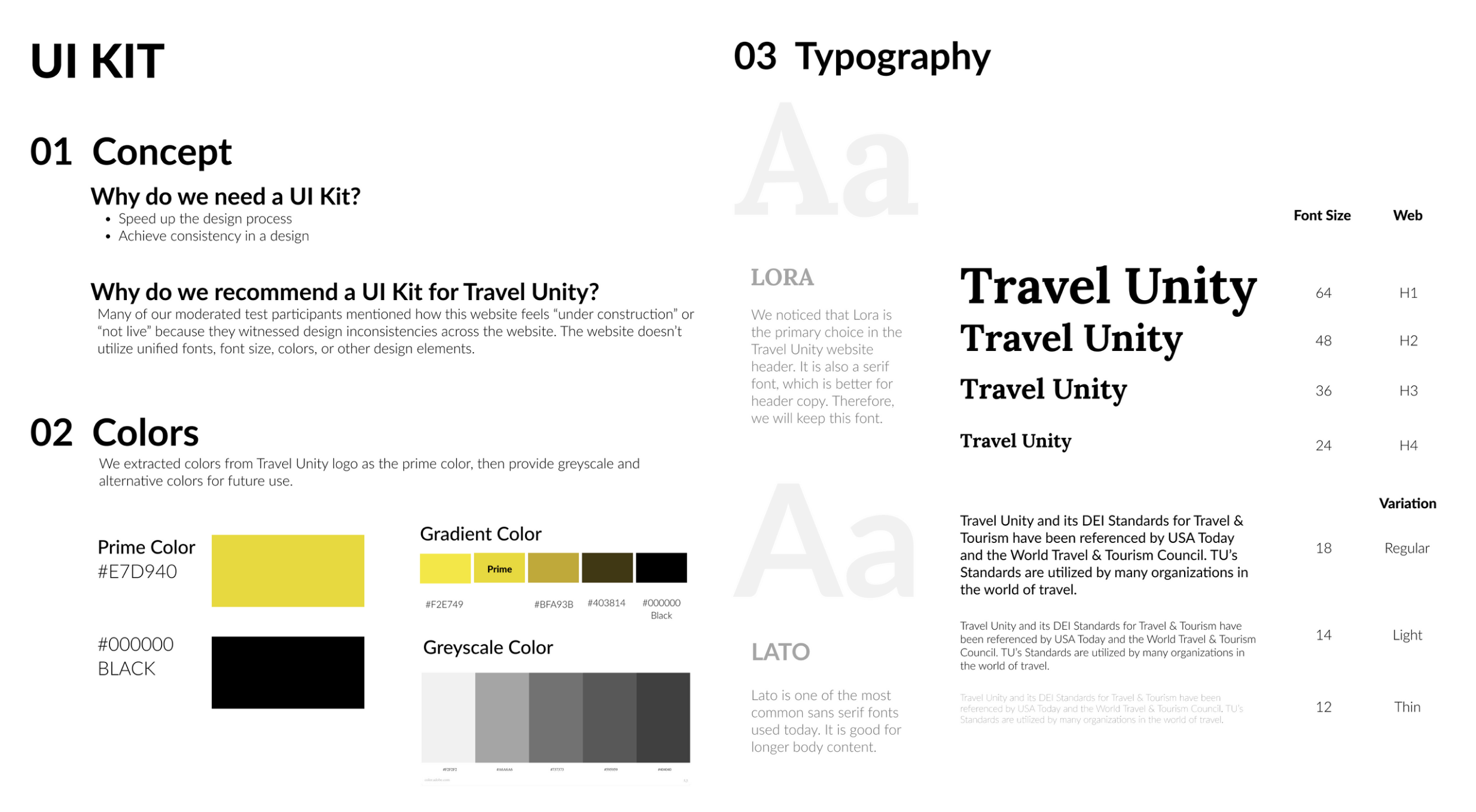
Create a Unified UI Style Guide
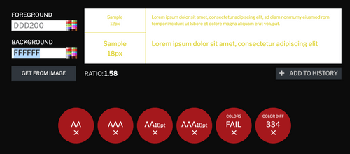
Ensure appropriate contrast in copy and links
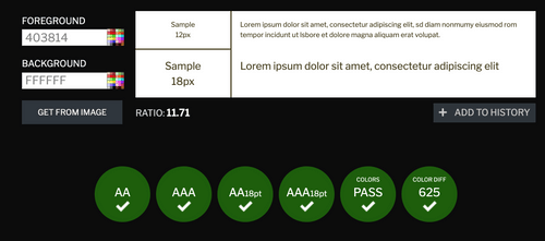
We educated the team about Contrast Checker to ensure text is adequately readable. For example, the links on the current website [#ddd200] do not pass an accessibility check at any font size.
Using one of the darker tints from our new style guide [#403814] would allow for the links to pass the contrast check. An underline or other style could be added to further differentiate the links from regular text.
Use different images for different page headings
Contact Page (After)
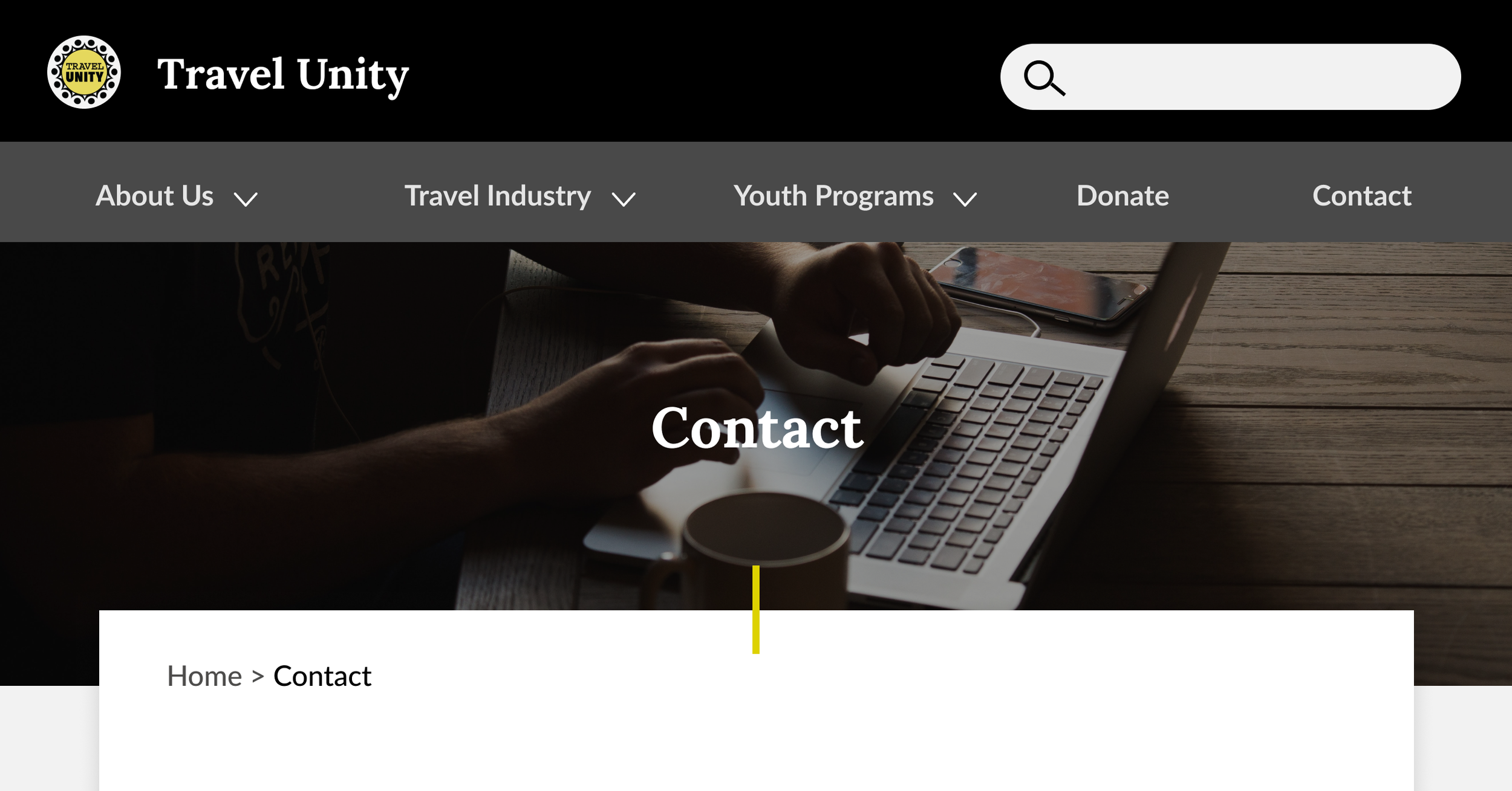
Youth Programs Page (After)
Apply large, easy-to-click buttons
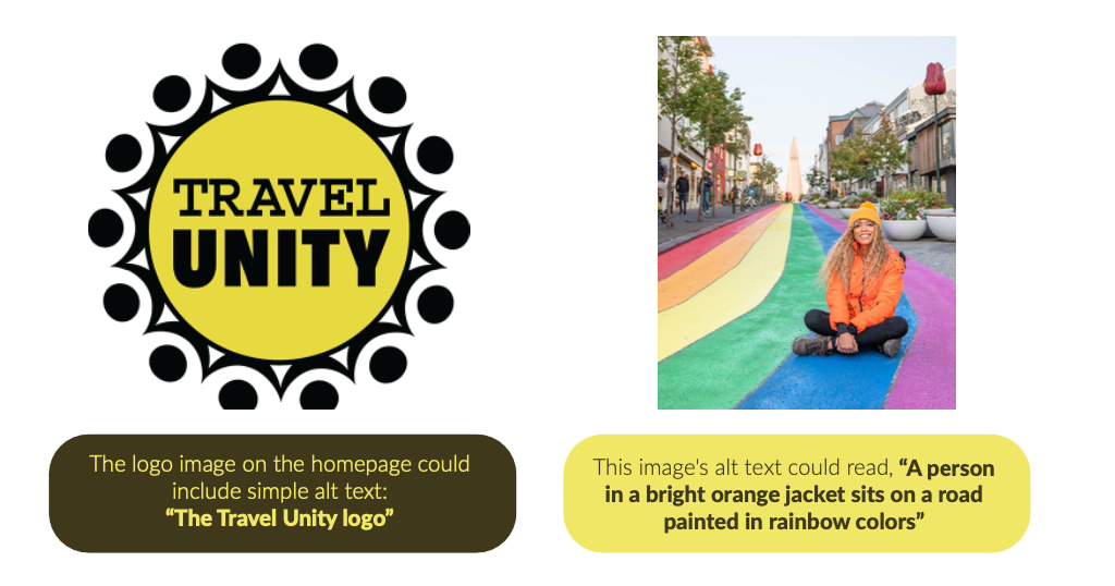
Use Alt-Text for image content
Conclusion & Next Steps
Travel Unity, a champion of DEI standards for the travel industry, plays an important role in educating young people about diversity, equity and inclusion, which is full of challenges. Our goal was to provide actionable steps that could improve the usability of the www.travelunity.org website.
The study’s findings showed us issues participants had understanding about the DEI, the organization, and youth programs. We are confident that improving the usability will be helpful for new and existing users. Given Travel Unity’s noble mission, we hope that its message connects with as many users as possible.
The next steps I would take, given the end of the project, would be the following:
Validate the recommended information architecture to confirm if anything else would need to be clarified via card sorting and/or tree testing.
Build a working prototype from the above recommendations and do further moderated user testing in order to validate the design recommendations. The focus particularly would be to confirm users are able to find the information they need and can navigate to the sections that are relevant to them without inefficiencies.