Bloomberg LP
Component Redesign, Design System
MY ROLE
Design Systems Lead
SCOPE
Interaction design
Stakeholder alignment
Cross-functional collaboration
Adoption strategy
TEAM
1 Visual design engineer
1 Visual designer
PMs across 100 product teams
Bloomberg LP is a financial software company providing data and other services to financial institutions and investors.
I led the redesign for a widely used component. By simplifying its implementation and improving its interaction, I helped create a more consistent experience for Bloomberg users across all product areas.
IMPACT
The redesign improved efficiency in many ways.
Eliminated a class of implementation errors by replacing manual, interpretation-dependent instructions with a fixed set of style classes — alignment and icon direction are now impossible to get wrong.
Migrated the component across 100 of the platform's highest-traffic products, directly improving consistency and predictability for users at the point of greatest impact.
Reduced implementation time for cross-functional teams, replacing a multi-step manual build with a single pre-configured component.
Prevented regression by updating the design system guidance to point to the new component, so future releases start from the correct pattern instead of reintroducing the old inconsistencies.
Reducing friction internally so that users have a better experience.
The Problem
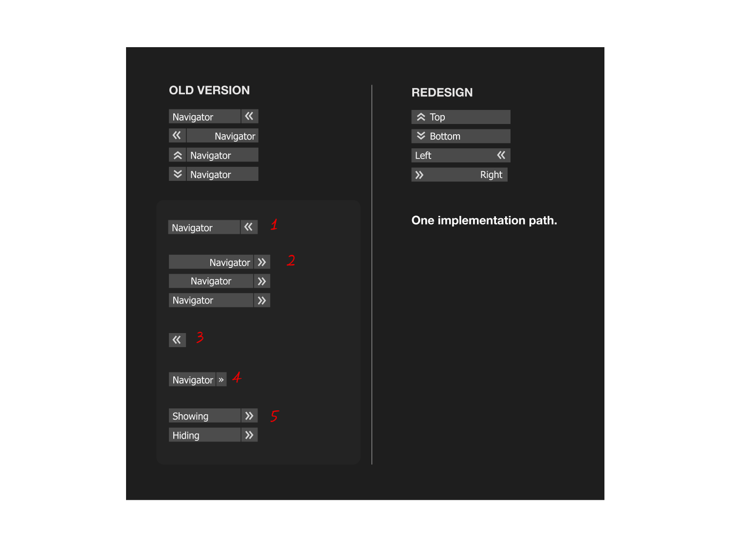
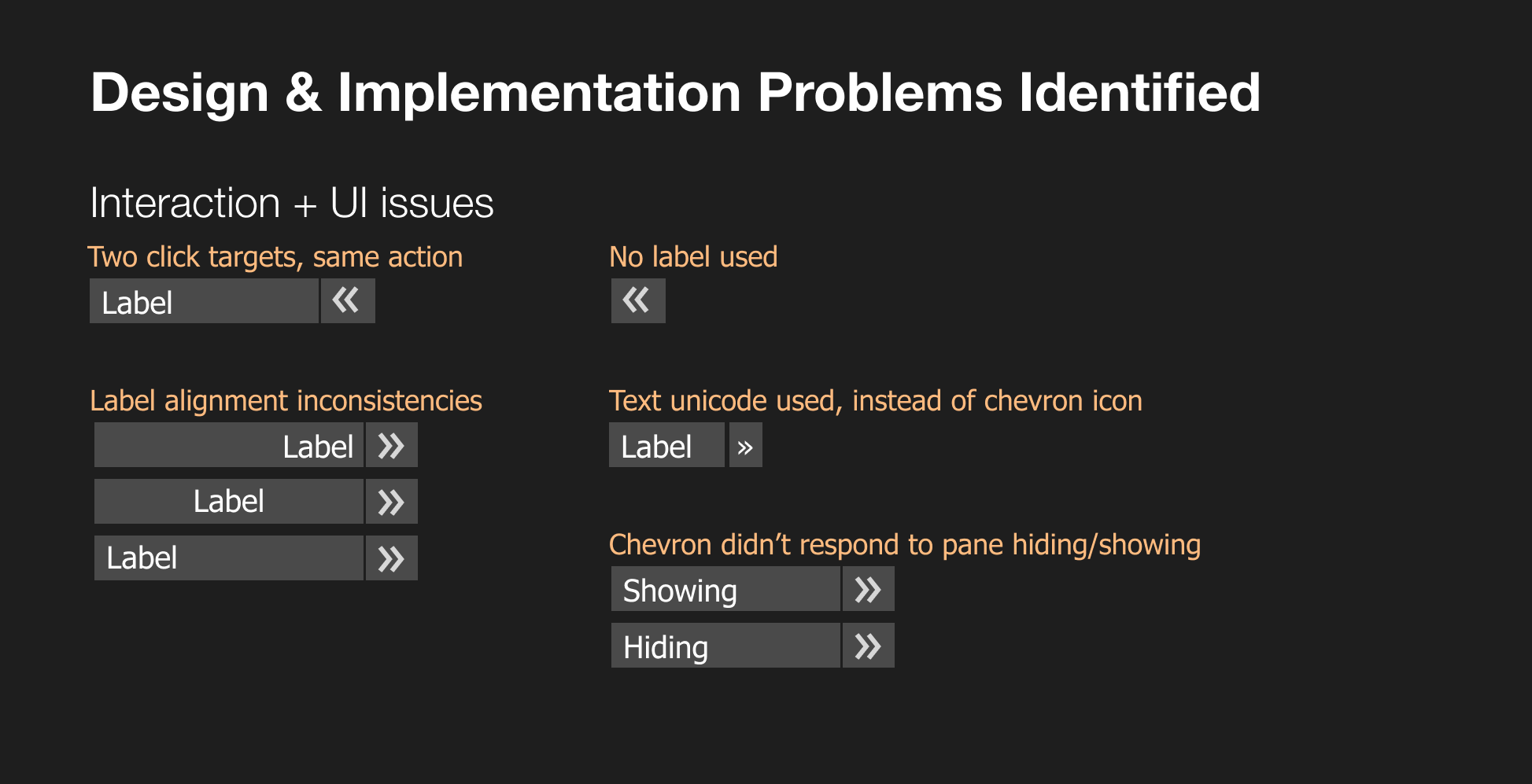
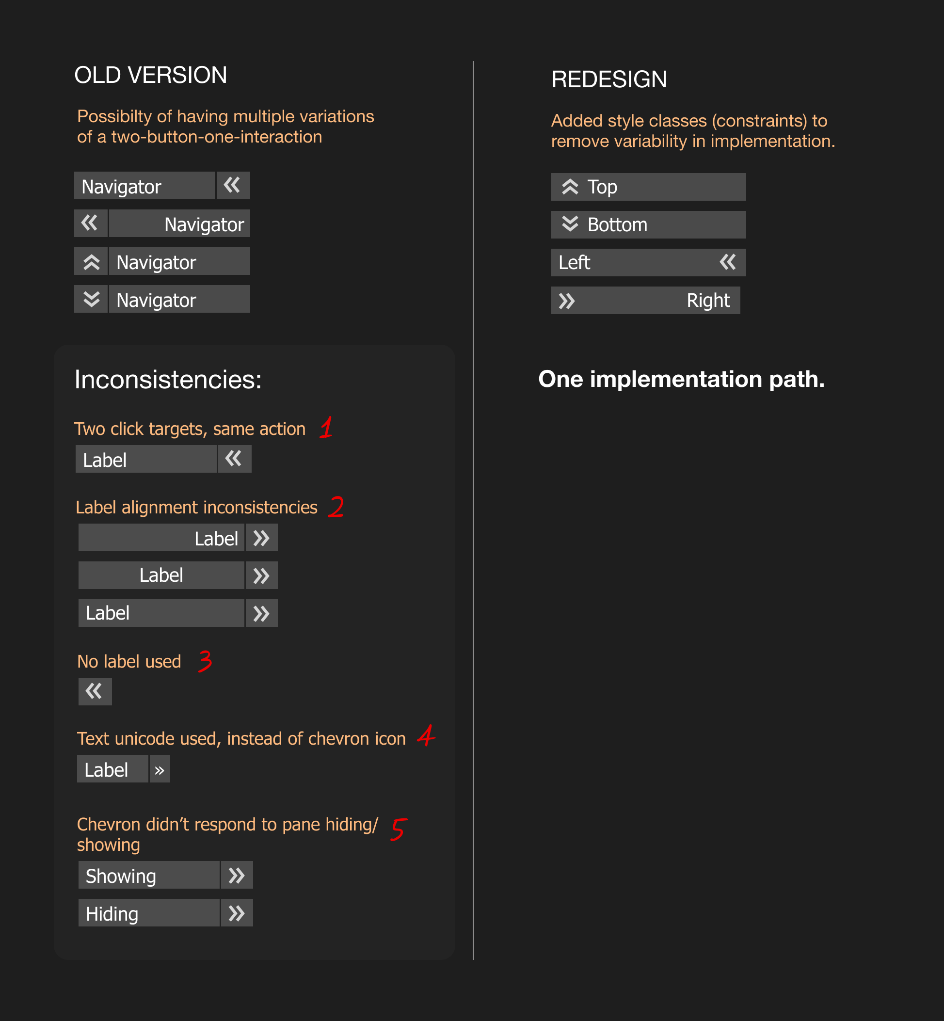
A frequently used UI component, a collapsible pane navigator, was being implemented inconsistently according to the UX Standards across Bloomberg's product suite. The same interaction pattern showed up with different visual treatments depending on which team built it: some used two separate click targets for what should have been one action, some skipped labels entirely, some used a text unicode character instead of a proper chevron icon, and label alignment varied from screen to screen. In several cases, the chevron didn't even reflect whether the pane was open or closed, breaking the core promise of the interaction.
I first noticed this pattern while reviewing UX across pre-release products and working on Bloomberg's design system standards: the same component, rebuilt slightly differently, again and again.
I began asking the following questions: Why was this component built inconsistently across different teams? Were the guidelines unclear? Was the process too convoluted?
The goal was to eliminate this inconsistency and improve the interaction of this widely used component.
DISCOVERY
Understanding the scope and background
Before thinking about a redesign, I needed to know whether the inconsistency was a symptom of something structural. I met with respective UX standards teams to trace the component's history to confirm the following:
Was there a historical or technical reason for the current design using two buttons to accomplish one interaction?
Was there a feasibility constraint forcing teams to build it differently each time?
How might we make the "right" way to implement this the easiest way?
How might we keep the visual language familiar while reducing the cognitive load of the interaction?
The guidance in our design library was clear for the most part, however teams were interpreting written instructions slightly differently, wanted to execute this UI as quickly as possible, or did not look at the guidance and created their own approach based on reviewing other products on the platform (which may or may not have been correct).
The current flexibility in the toolkit left room for subjective judgment calls, and those calls compounded into visible platform inconsistency.
Implementation issues were complicated, and had little constraint - leaving room for incorrect builds.
The steps to create the navigator component were tedious and left lots of room for subjective choice, interpretation, or oversight.
Steps:
Add a button
Add text
Ensure proper text alignment
Add a second, adjacent icon-only button
Choose the proper “chevron” icon
Ensure proper direction is implemented
Add logic interaction on icon when opening/closing the navigator pane.
DESIGN
Creating clarity in product interaction
I worked closely with a visual design engineer and visual designer, and moved the component from a manually-assembled pattern to a single, style-driven component.
Instead of asking implementers to choose label alignment and chevron direction by hand, I implemented, with the help of the engineer, a set of fixed style classes tied to the function of the component.
LEFT_LEFTJUSTIFIED
RIGHT_RIGHTJUSTIFIED
TOP_LEFTJUSTIFIED
BOTTOM_LEFTJUSTIFIED
Each class automatically pairs the correct label alignment with the correct chevron direction and state behavior, so "getting it right" stops depending on someone reading and correctly interpreting multi-step instructions.
The interaction itself also simplified:
one click target instead of two,
a proper directional icon that responds to open/closed state, and
consistent label presence across every instance.
This was the core design principle: reduce the decision space for engineers so that inconsistency in the platform is reduced for end users.
Steps reduced to two:
Add a button
Choose button style (with built-in logic)
UX documentation needed to be updated
To prevent regression of the incorrect use of the navigator pattern, I udpated the UX documentation guidance so new products adopt the new component by default.
Driving Adoption
Its’s important to get the new component out as soon as possible to existing products so that there isn’t a gap between existing and new releases using this pattern.
I ran a query to identify the top 100 highest-traffic products still using the old implementation, and worked directly with those product teams to migrate to the new component. This approach allowed us to prioritize working with teams based on user impact.
OUTCOME
The redesign improved efficiency in many ways.
Eliminated a class of implementation errors by replacing manual, interpretation-dependent instructions with a fixed set of style classes — alignment and icon direction are now impossible to get wrong.
Migrated the component across 100 of the platform's highest-traffic products, directly improving consistency and predictability for users at the point of greatest impact.
Reduced implementation time for cross-functional teams, replacing a multi-step manual build with a single pre-configured component.
Prevented regression by updating the design system guidance to point to the new component, so future releases start from the correct pattern instead of reintroducing the old inconsistencies.
REFLECTION
Guidance sometimes isn’t enough…
Clear documentation wasn't enough to have teams adopt a correct implementation of the navigator pattern. When teams are moving fast, the system has to make the right choice easy. In this case, constraints were the perfect solution to prevent errors in implementation, and therefore inconsistency in the platform.