Local Eclectic
Heuristics Evaluation

MY ROLE
Heuristics Evaluator
UX/UI Design
SCOPE
Evaluation
Design
Report
TOOLS
Figma
Google Sheets
This report covers Jakob Nielsen’s heuristic evaluation that was done on two tasks in website: localeclectic.com, by four usability experts. The given tasks were able to be executed and there were no major usability issues, however the results showed some confusion and inefficiency that ultimately led to, or possibly could lead to, some usability issues.
The following recommendations are based on the usability issues that were found.
These recommendations surround an improvement in signifiers and content, in order to make the actions that are available to the user more clear. The suggestions should also potentially help prevent users from making errors.
• Recommendation #1 - Change signifiers, layout and labeling in the checkout bag
• Recommendation #2 - Streamline the content in help documentation
• Recommendation #3 - Fix visual elements and signifiers to help clarify affordance
Executive Summary
DEFINE
Defining the scope
Goals
A heuristic evaluation report was done on the website: localeclectic.com. This website is a jewelry site that showcases unique jewelry pieces from several designers. The goal of this evaluation was to identify all usability issues given two tasks. The basis of the evaluation is per Jakob Nielsen’s 10 Usability Heuristics.
There were four usability experts that performed a heuristic evaluation on this website for the two scenarios that was given by a lead evaluator. Each usability problem was given a severity rating to ultimately help drive what issues should be given most priority to allow for UX/UI recommendations.
METHODOLOGY
Using NN Group’s heuristics evaluation method
Heuristics
The heuristic evaluation was based on Jakob Nielsen’s “10 Usability Heuristics for User Interface Design” (https://www.nngroup.com/articles/ten-usability-heuristics/).

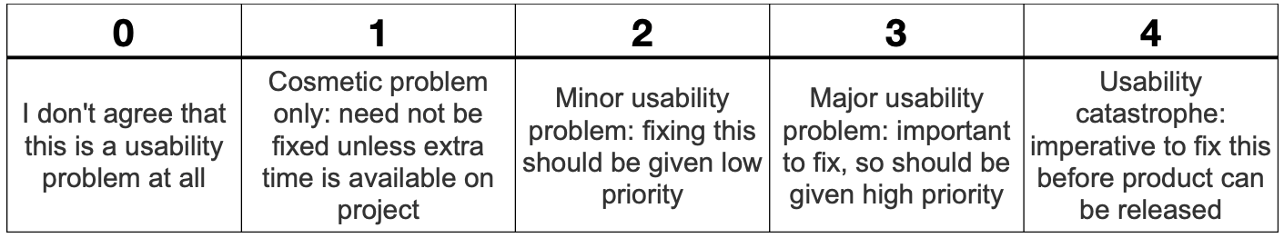
Severity Ratings
The severity ratings provides an indication of prioritization for fixing the usability problem.
There are three factors to consider when assigning severity: the frequency, impact, and persistence of a problem (https://www.nngroup.com/articles/how-to-rate-the-severity-of-usability-problems/). The rating scale is as follows:
Scenario
The scenario is that you are a shopper and are interested in buying jewelry.
As the lead evaluator, I provided two tasks to four usability experts to perform a heuristic evaluation.
Tasks
Find an opal ring for under $50 and add it to cart. Continue back on the site and confirm it was added to your cart.
Confirm what the return policy is for refunds.
DELIVERY
#1 Change signifiers, layout and labeling in checkout page
This finding results from the evaluation of Task 1. While the action of adding a product to bag was easy, there was confusion amongst three out of the four evaluators about the recommendations shown in checkout.
• The recommended list is a business opportunity to sell more, but it led to ambiguity.
Was the intended chosen product actually in the bag? Were the recommended products automatically added? What are their prices?
The added product’s price also didn’t not show up in the cart review.
• These issues clashed with Heuristic 1 and 8: “visibility of system status” and “aesthetic and minimalist design”.
Current

The recommendation is to update the layout, signifiers and labels to provide a clearer next step to the user in finalizing their bag to check out (highlighted in the image to the right).
• I updated the hierarchy and moved the suggested items below the cart information
• Added price information for intended product and suggested items
• Added labels to the quantity and size to further add clarity
Recommended

Findings & Recommendations
#2 Streamline “Help” documentation
This finding results from the evaluation of Task 2. The manner of getting to help documentation was not much of an issue, though there was feedback about the difference in labels between the tab navigation and footnote. Nevertheless, 75% of evaluators found the help page problematic as it contained language that could be overlapped, as well as content that might be related but lived in separate sections.
• For example, one evaluator found that the label refund was more clear than returns. Users may not separate the concept of a return and refund. This goes against heuristic 2, Match between the system and the real world. Another evaluator found that it took too long to find the information that was needed because there are several sections within the page. The opportunity to improve heuristic 10, help and documentation.
Current

The recommendation is to streamline the returns and exchange information in order to reduce the amount of information and visual load.
• Therefore, my recommendation is to separate “Returns & Exchanges” from one section into two separate sections. Then also eliminate the “Refunds” and “Store Credit” sections and move the content into the respective “Returns” or “Exchanges” section.
• The expand/collapse labels within the “Refunds” and “Store Credit” have minimal information and can be combined into a single expand/collapse label.
• My mockup in the next slide kept the current language pattern that exists in the current version of the website.
Recommended

#3 Update signifiers and UI for improved interaction
The last finding is a theme across Task 1 and 2. It regarded a couple of poor signifiers resulting in clickable and not clickable items are treated the same visually (Heuristic 1, 7 and 8).
The impact of this is the possibility of:
• Missing the “Sort” affordance
“Best Selling” drop down does not look like a drop-down interaction Drop down items
• Overlooking “Order Status and Shipping” interaction since it looks like a header
• User thinking that the hours of operation information was clickable because of the hover state. Also, some of the menu drop-down items are clickable but there is no indivation of such.
Current

The recommendations require updating the signifiers and alignment.
• Add a label to the drop-down, and update the “Sorting” drop-down UI to be consistent with the rest of the website’s UI.
Update UI for menu Drop down items:
• Left align the “Order Status and Shipping”
• Add a section line for hours of operation information
• Add signifiers, arrows and icon, next to actionable links
Recommended

FINAL WORDS
Overall, the usability issues that were found in the Local Eclectic website, via Nielsen’s Heuristics, were not extremely severe.
The tasks were able to be executed and there was no major usability issues, however there was some confusion and inefficiency which ultimately led to, or possibly could lead to, usability issues.
Between the four evaluators, the average issues found for each was about 4.
The notable issues related to the:
Recommendation visuals in checkout bag
Content in the ‘returns’ help page
Poor use of signifiers.
The recommendations improve the signifiers and content, and therefore the actions available to the user are made more clear. The recommendations also potentially prevent users from making errors and finding the appropriate information that they need.